A well-loved transformation appeals to everyone, whether it involves a home, a wardrobe, or, in our instance, a rebrand. There’s an undeniable allure to that captivating before-and-after moment. Why? Because a rebrand isn’t really a design challenge; it’s a communication challenge—one that requires you to use every asset available to reinforce your brand story with thought, care, and intention. That’s why we love geeking out over great rebrand examples from all corners of the Web. (We’re guessing you do too.)
15 Rebrand Examples to Inspire You
Whether you’re gearing up to rebrand or just a fan of great work, we’ve rounded up 15 great rebrand examples that prove how successful a rebrand can be when approached from both a strategic and creative standpoint. From print magazines to pain relievers, we hope you find a little creative inspiration in these brands’ work.
1) Fast Company
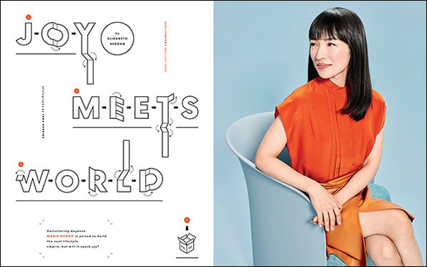
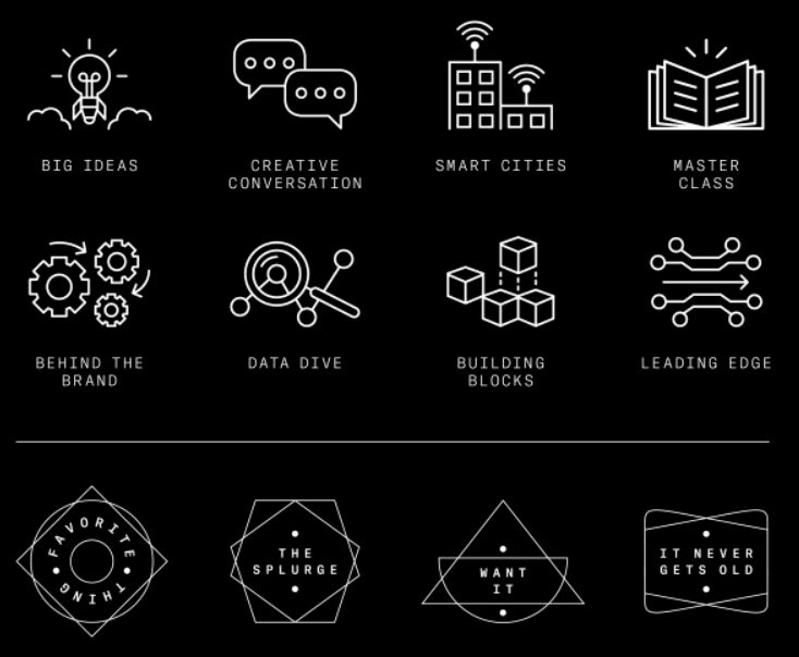
Sometimes you don’t quite get a rebrand right the first time—and that’s OK. After having rebranded in 2018, Fast Company realized they needed to realign their visual identity to the brand’s three visual principles: sophisticated, playful, and gender-neutral.
Thus, the design team embarked on a mission to anchor their visual language through subtle changes. They moved away from aggressive all-caps headers, added iconography to distinguish sections, included a fluctuating design for page numbers, and introduced a more playful element. The result? A refreshing update that keeps the brand true to its core values.
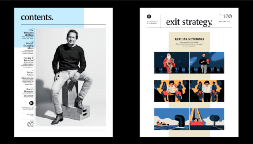
Image source: Fast Company; Photo: Guerin Blask; Illustration: Bruno Mangyoku
Image source: Fast Company; Photo: Cara Robbins
Image source: Fast Company; Icons: Chelsea Schiff
2) Rolls Royce
How do you take a brand built on elegance and wealth (one basically made for the Monopoly Man) and give it a younger, hipper, fresher look? That was exactly the challenge the luxury car maker faced with their 2020 rebrand.
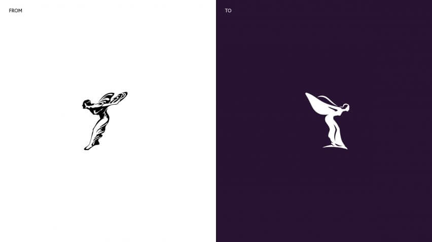
Pentagram led the charge by balancing a sleeker, more modern look with nods to the brand’s history. They updated the Spirit of Ecstasy emblem and refined the brand’s iconic double-R monogram. To modernize the color palette, they leaned toward more gender-neutral tones but retained the regal spirit of the brand through rich purple hues and rose gold. And for typography, they turned to Elegant Riviera Nights, featuring beveled edges that add sophistication and style.
Overall, it’s a beautiful rebrand that welcomes younger generations into the lap of luxury.
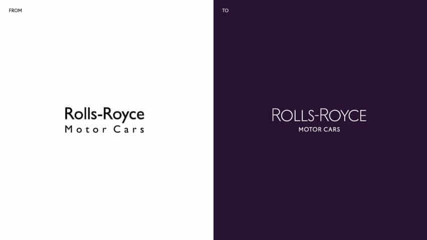
Images source: Pentagram/Rolls Royce
3) Medium
Medium is a global platform that reaches 170 million readers, but the brand felt limited by its old identity. As part of the company’s shift to facilitate more dialogue between readers and writers, they needed a creative, flexible language that would evolve with the brand and allow designers to depict an array of ideas. To achieve this, Medium tapped Collins to tackle their rebrand.
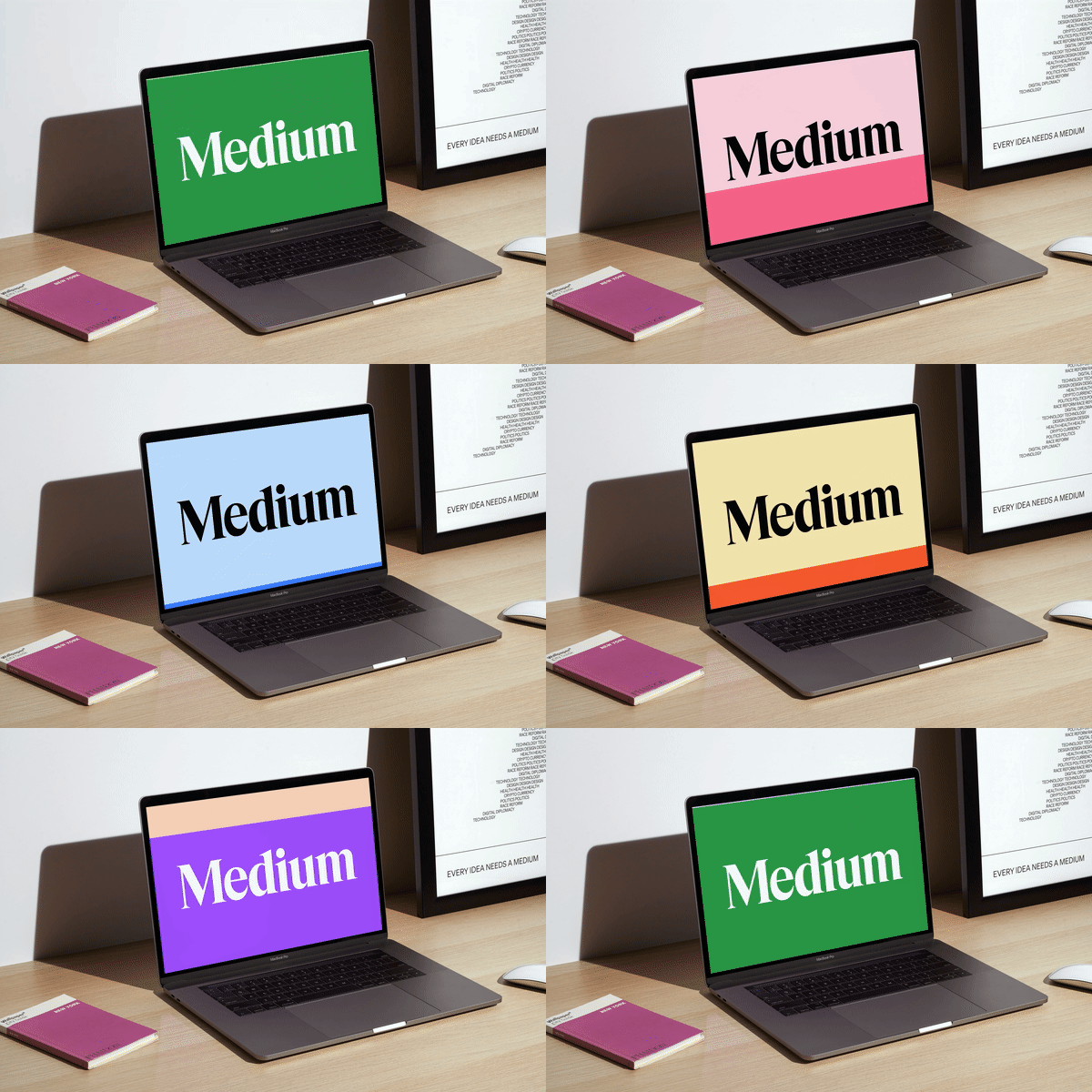
Thus, the logomark got a simple but effective polish, with tighter tracking and smoother lines, accompanied by a new symbol: a three-dot design inspired by an ellipses. The color palette also expanded, giving designers a rainbow to play with. And, as Medium is all about the written word, Collins incorporated actual language into the visual language through images created from letters and words.
This blend of creativity and functionality makes this an A+ rebrand in our book.
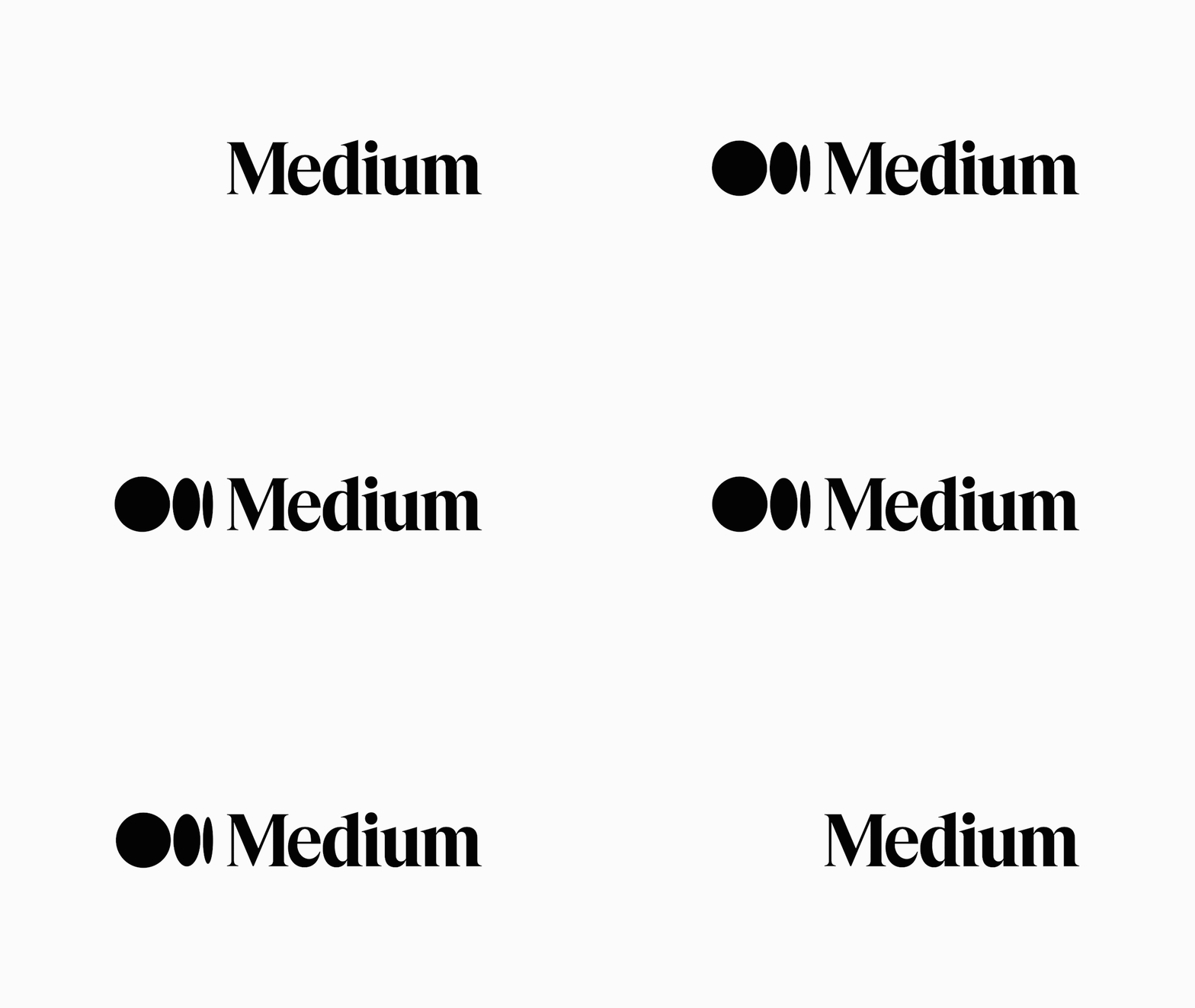
Images source: Medium
4) Buck
We love when a brand’s story lives in its visual language. Hence, while we appreciate every element of Buck’s overhaul, we especially love the story behind their wordmark and logomark. As the brand explains: “Inspired by our namesake, Buckminster Fuller, and his approach to systematic design, each individual letter is based upon a common architecture.” This is thoughtful, creative branding at its best.
Images source: Buck
5) GoDaddy
Fun fact: GoDaddy hadn’t touched their branding in 23 years and, boy, was that obvious. Naturally, their brand has expanded greatly in the last two decades, so a brand refresh was long overdue.
Their brighter, fresher approach is a sight for sore eyes. Focusing on the “go” in “GoDaddy,” the new logo turns the “g” and “o” into an interlocking heart design, a clever nod to their forward-thinking approach. While “daddy” still lives in the name, the switch to a more inclusive color palette includes a bold teal, which is eye-catching without being invasive. And the functional typeface of GD Sherpa is clean, confident, and functional, helping them communicate more effectively.
Images source: GoDaddy
6) Origo Coffee
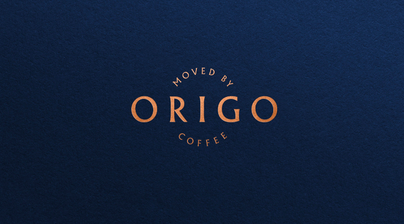
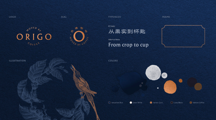
In a move to capture the luxury coffee market, Chinese coffee brand Origo needed an elevated, sophisticated visual language to reinforce their artisanal approach and pride in its Chinese roots, so they turned to MetaDesign Beijing.
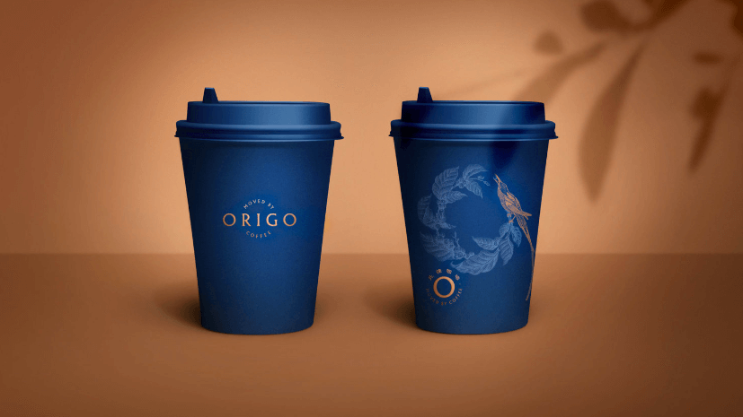
The rebrand theme was “Moved by Coffee,” and the execution expresses this in every aspect. From the elegant, round circle of their logomark (a reflection of the swirl of coffee through a filter), to the earth-toned color palette (a nod to the coffee bean), to the beautiful hand-drawn illustration that communicates the artisanal nature of the product, they crafted an elegant but grounded brand.
Images source: Origo
7) GO1
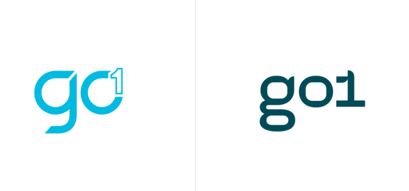
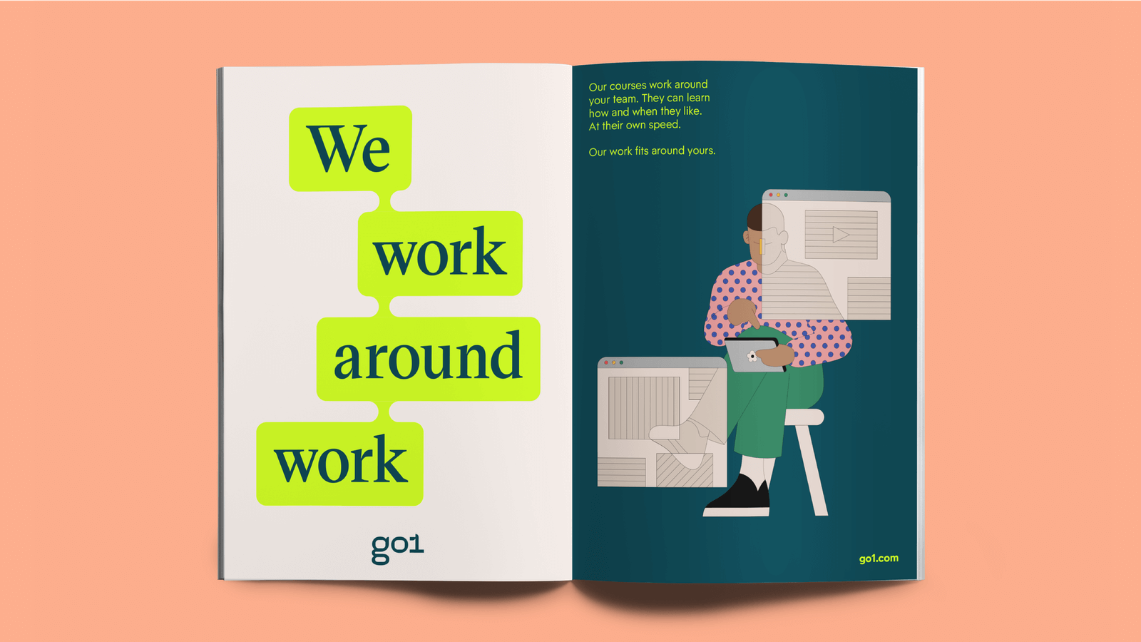
In honor of its 5-year anniversary, education startup Go1 needed an updated identity to bring them into the next decade, so they called on DesignStudio.
As Go1 is a platform that helps people learn quickly and effectively, the idea of “Learn Athletic” became the rally cry of this identity. The visual system celebrates the joy of learning with a bold and colorful palette, playful illustrations (including the logomark), and graphic shapes, such as connected boxes that communicate the unique, agile way the content they provide can be connected in a learner’s life.
Logomark Before/After
lllustrations: Camilo Huinca
8) Laka
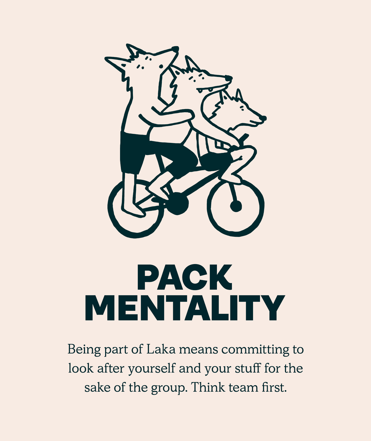
Laka is an insurance company for bicyclists, but they have a unique model. Instead of paying for an accident that might happen, it’s a community collective, where people pay into a pool to cover current member claims.
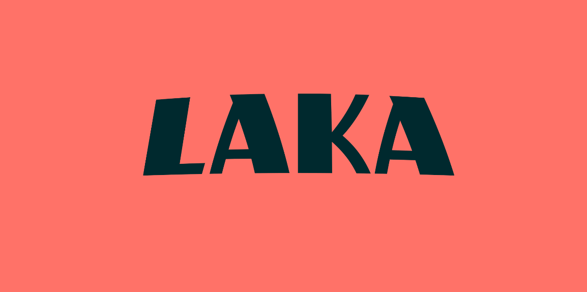
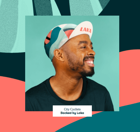
To emphasize this communal angle, branding studio Ragged Edge focused the rebrand on the community itself. Bold colors celebrate the joy of cycling, used in patterns that represent the mud, sweat, and tears on a cyclist’s bib shorts. Playful type is simple but unexpected. And colorful portraits of their diverse members put a human face to the often faceless insurance industry. The result? An insurance brand that feels like a lifestyle clothing brand. That’s an epic feat.
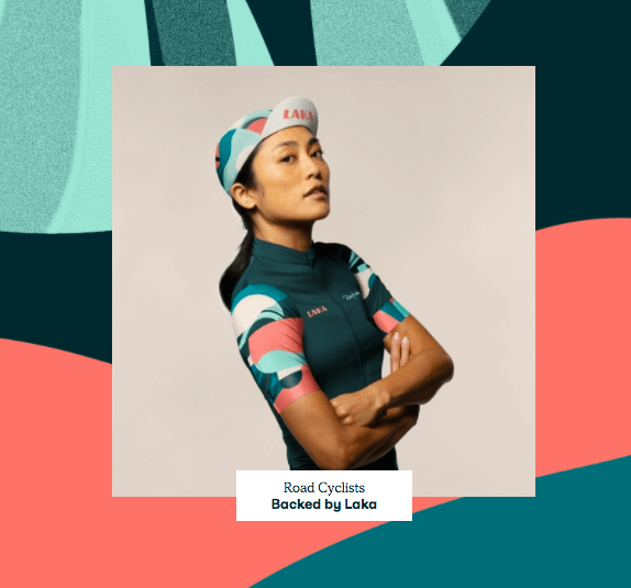
Images source: Laka
9) Intel
Intel hasn’t done much rebranding in its history. In fact, they’ve only had two logos since being founded in 1969. (That’s two logos in 50+ years!) Naturally, they were due for a rebrand.
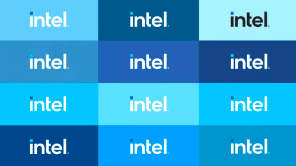
This fresh iteration takes a more minimalist approach while expanding the tools brand designers can use to communicate the brand.
This includes an expanded color palette (a welcome change beyond the standard blue) and incorporates elements of the past—but with a modern twist. The original logo version featured an “e” dropped below the other letters; the second added the swirl. This new logo includes elements of both in a much more subtle, minimalist design. It’s a brand identity that pays homage to their history but pushes the brand into the future in a practical way.
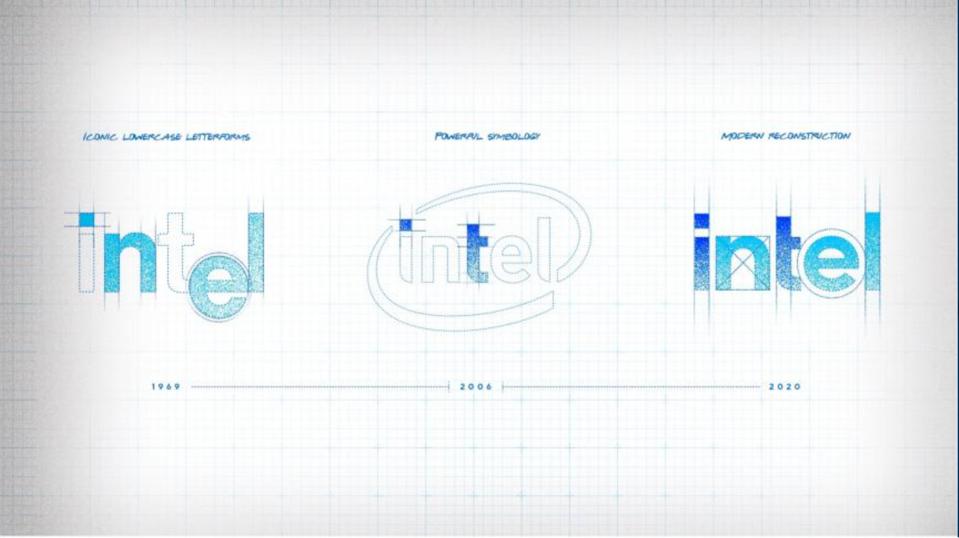
Images source: Intel
10) Midol
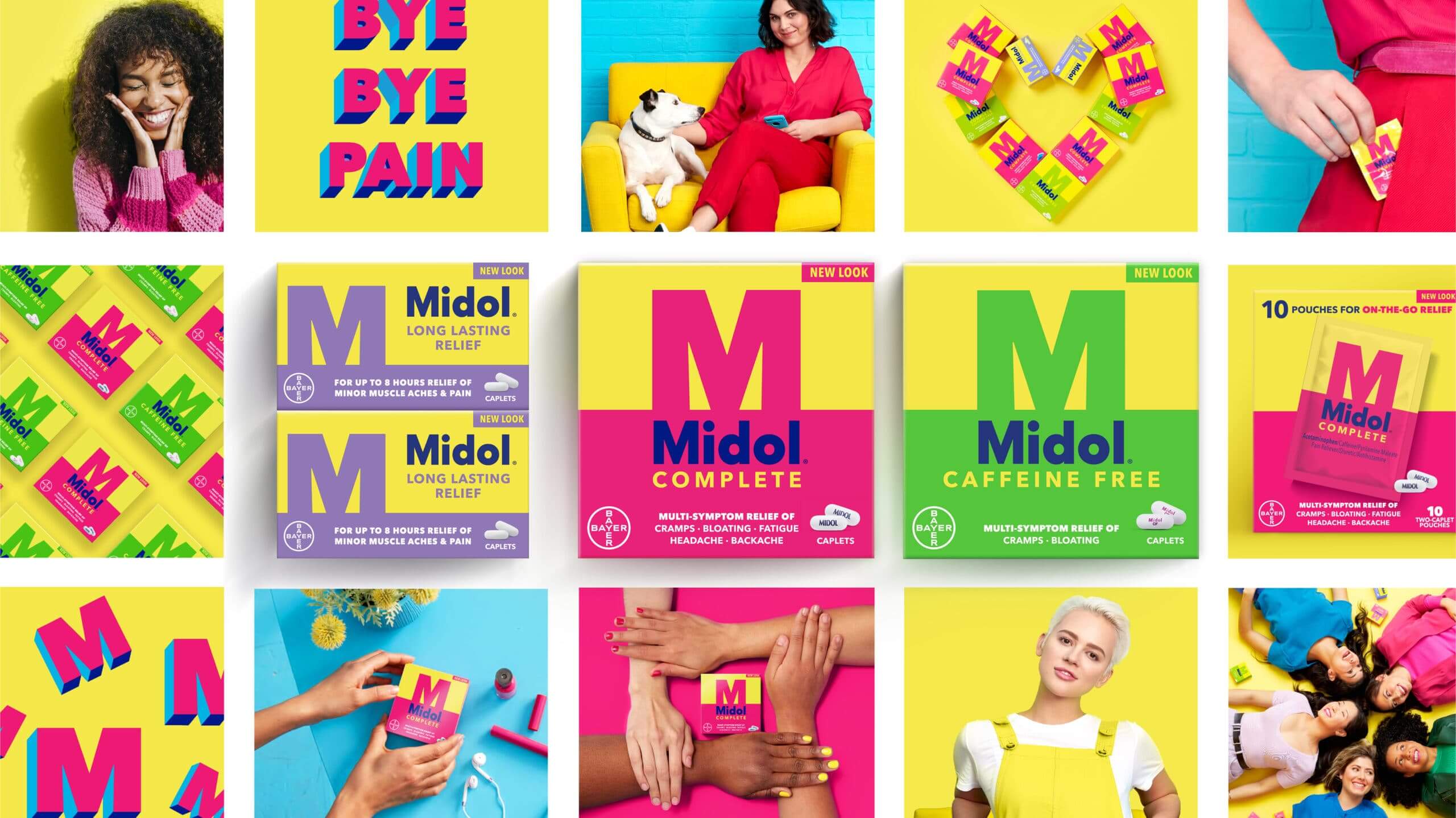
Midol was established in 1938, and although the brand had been a mainstay for decades, it needed to forge a new relationship with Millennials and Gen Z. Unfortunately, their research showed that the brand was so far from mind that people couldn’t even remember the color of their packaging. To remedy this and reintroduce the brand to younger generations, Midol turned to GoDutch and Oliver.
Hoping to put the brand back in the spotlight, the design team focused on a brighter, bolder color palette of pinks, yellows, and greens that reinforce the fun and joy of a pain-free life. For typography, they went bold, reflecting modern female values of strength and independence vs. older values of daintiness and passivity. Let’s just say this is not your mother’s Midol, and we think that’s a great thing.
Images source: Midol
11) Stonewall
Named after the Stonewall riots, the Stonewall charity is a UK-based organization that fights for LGBTQ+ rights. In need of a rebrand, the organization turned to creative agency Jones Knowles Ritchie, who used expert visual storytelling to pay homage to the past and create an identity for the future.
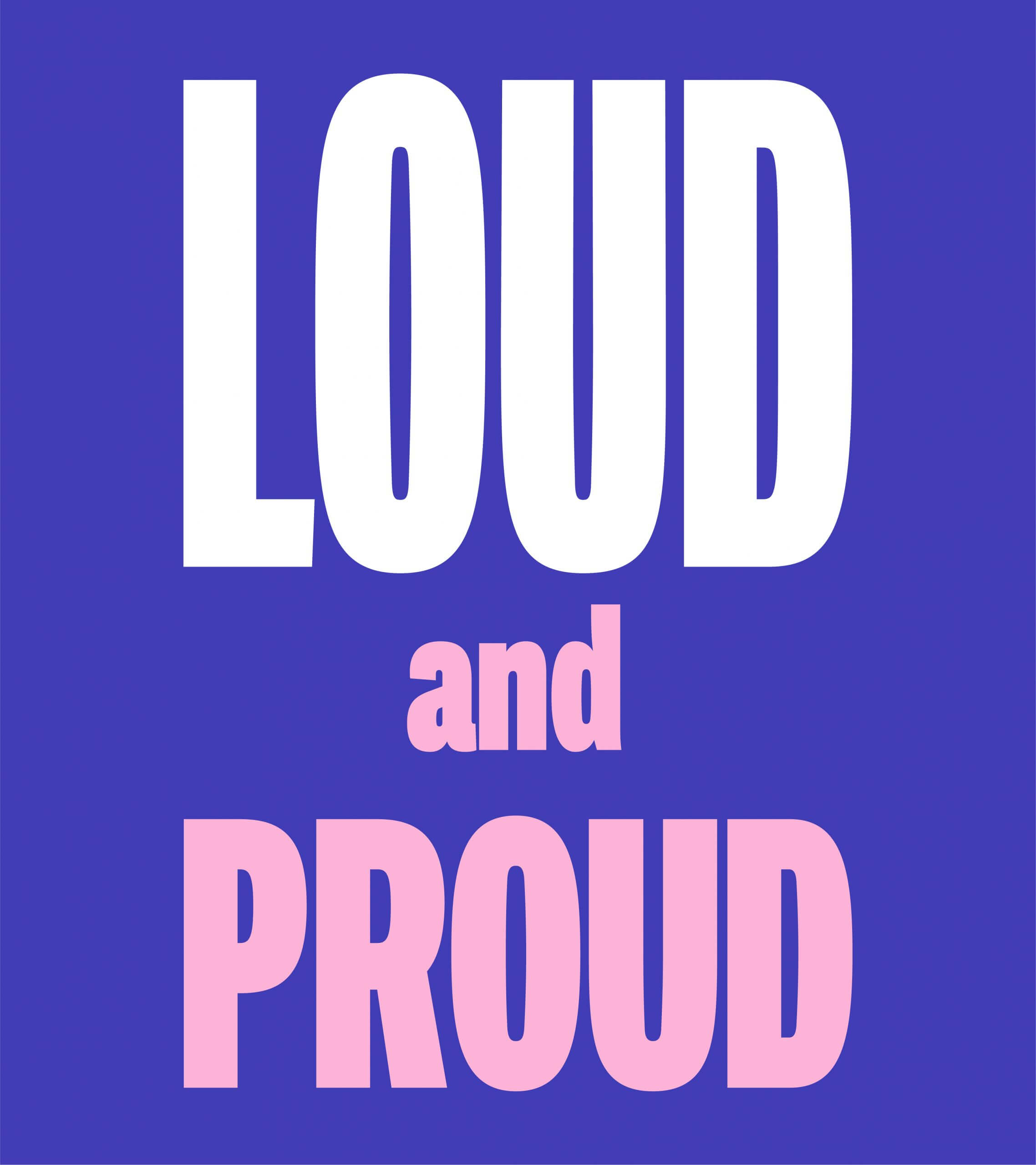
To usher in a new era of activism, they chose a colorful palette, inspired by the rainbow flag. They designed a custom font inspired by protest signage. And they completed a beautiful logo redesign, which includes an arrow sandwiched between an equal sign (clever use of negative space). It also appears vertically in homage to the original Stonewall Inn sign. This is brand storytelling at its best.
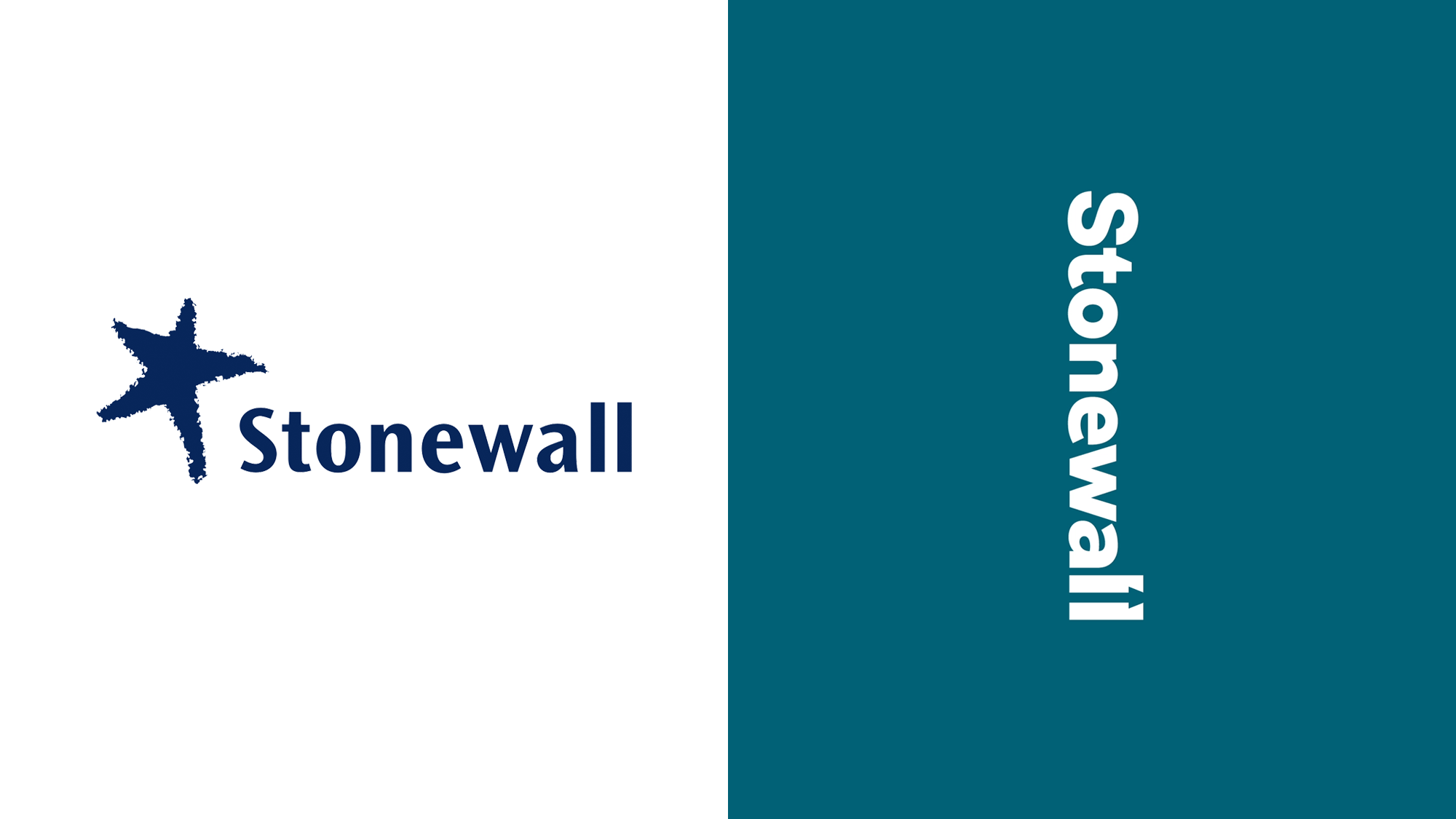
Images source: JKR
12) Momentive
When Survey Monkey embarked on a rebrand, they turned to what they do best: the research. As their old identity no longer aligned with their new business strategy, they strategically approached the rebrand to ensure the new identity would resonate with their audience and support the brand’s evolution going forward. The result was a new name, logo, positioning, and visual identity that used elements of their past (e.g., the green of their old logo) while bringing the brand into the future. The logo is particularly unique, visually blending elements representing both humanity and tech to create a data visualization. A+ for using data to inform design.
Image source: Momentive
13) GlobalFoundries
The semiconductor industry is steeped in technology and innovation, but that doesn’t always translate to branding. Hence, semiconductor manufacturer GlobalFoundries desperately needed to rebrand. Their old logo was a ’90s relic, and the brand was eager to usher in a new era focused on optimism and innovation within the industry.
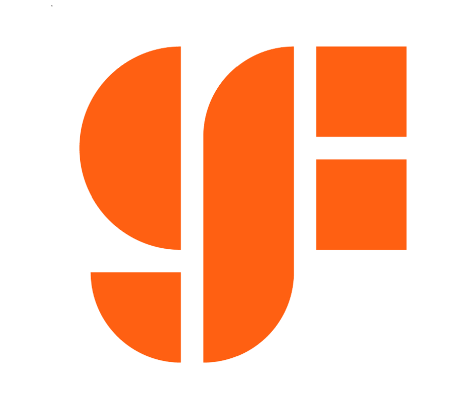
The answer? A chic and streamlined logo (we particularly love the two squares that create the “F,” which represent semiconductor chips). While the brand kept its signature orange color, which speaks to the brand’s warmth and optimism about the future, they swapped the dull gray for bolder accent colors: purple and yellow. This may seem like an unexpected choice for a tech-centric company, but that’s exactly why we love it. It’s a bold declaration steeped in confidence.
Image source: GlobalFoundries
14) King Arthur Baking Company
When the Pandemic turned everyone into a home baker, King Arthur Flour realized it was time to reassess their brand. Since its inception (in 1790!), the brand centered flour at the core of its business but has since expanded into a full-fledged baking company, offering a variety of goods and services. Thus, their name was no longer accurate, and their logo—featuring King Arthur on horseback—felt dated too.
To shift the focus from flour to baking, while preserving their regal heritage, they simplified their logo. By swapping King Arthur himself for a crown made of wheat (a beautiful and creative choice) and incorporating a simple sans serif font, the brand positions itself as a baking brand for those who want the best.
Image source: King Arthur Baking Company
15) Kroger
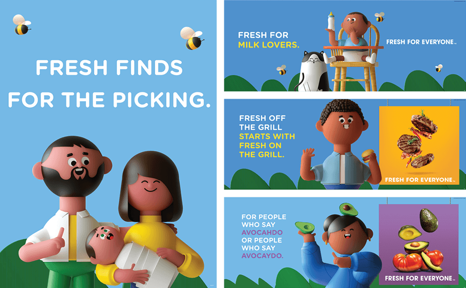
When Kroger tackled its rebrand in 2019, they went all in. With their new “fresh for everyone” tagline, they found their brand ethos and built a fresh identity that is inviting and engaging.
As an egalitarian brand that offers good food to everyone, they sought to modernize and create a more accessible brand. They chose a bright but modern color palette, designed a fresh logo (featuring a “fresh cart” icon that turns a healthy orange slice into a shopping cart), and created playful “Kroji” (Kroger + emoji) characters that reflect their range of customers. It’s a seamless rebrand that speaks to their audience and supports the brand’s positioning in the best way.

Image source: Kroger
How to Tackle Your Own Rebrand
As these examples show, good rebrands are the result of strong strategy, smart planning, and creative talent. If you’re getting ready to embark on the process for your own company…
- Know why you’re doing a rebrand.
- Follow best practices.
- Get inspired.
