I regularly sign up for email newsletters so I can learn from brilliant companies and individuals who gather up their best material and send it right to my inbox. In fact, over the past few years, I’ve probably signed up for 350+.
But there’s a particular piece of the getting-started process for email newsletters I’ve been fascinated by lately: the welcome email. You know: the automated email that gets sent after you confirm your subscription.
I wondered: If I signed up for a slew of different newsletters right now, what patterns would I find in the welcome emails I received?
Rather than scouring the internet for the latest article/summary, I wanted to get a bit hands-on and draw my own conclusions. So I got to work.
I signed up for 30 newsletters across six different verticals and started looking for the common trends and tactics that were being used in the welcome email environment.
The verticals included brands in these six categories:
- Publishing/News
- Restaurants
- Home Goods
- Online Courses/Membership Communities
- Non-profit
- Software as a Service (SaaS)
What I discovered was unexpected.
The One Welcome Email Tactic That Stood Out
When I looked back through my inbox after a week, I noticed there was one tactic that stood out within the welcome emails I received: Many were simply text-based.
They looked like real, one-to-one messages written just for me. No flashy design elements – just words.
I wasn’t expecting that. I was expecting to see lots of highly-designed templates. Some professional graphics. Animations and/or gifs, maybe. And yes, there were some of those in the mix, but more than half went with the stripped-down, traditional email look.
Of the 30 newsletters I signed up for, 18 were either plain text or extremely lightweight (meaning they included only minimal design elements like a logo or a single image).
That means more than half – 60%, to be exact – were using the plain text approach for their automated welcome emails to newsletter subscribers.
Why Plain Text, Though?
At a high level, my first question around the prevailing plain text trend was…why?
I did some research and found some pretty solid reasoning for this approach.
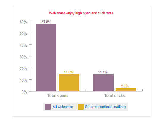
First, we need to recognize that welcome emails are among the most read and clicked emails. According to Experian research, welcome emails have high open and click rates, with an average of about 58% for opens and 14% for clicks, while other promotional emails average only 14% for opens and 3% for clicks.
Additional data indicates that welcome emails are actually read much more often than the average email, too. These introductory messages have around a 34% average read rate, which is 42% higher than the average.
Knowing these stats, we can see that the welcome email is a rare moment of opportunity.
So how are marketers leveraging it?
Plain Text Formatting and Welcome Email Optimization
Plain text formatting is a good starting place to optimize an organization’s welcome emails.
Findings make a strong case for plain text (or at least very limited design elements) over HTML-ridden templates. In many cases, text-only can help create a stronger dialogue with subscribers, increase deliverability, boost click-through rates, and more.
Let’s look at the trend in more detail.
1. Journalistic Emails Are on the Rise
ContentStandard recently highlighted a new kind of email that’s becoming popular: the journalistic style. These messages focus on storytelling and are created specifically for the inbox, often exploring topics in greater detail. This somewhat exclusive content is designed with email subscribers in mind and allows the writing to stand out on its own, without relying on attention-grabbing designs.
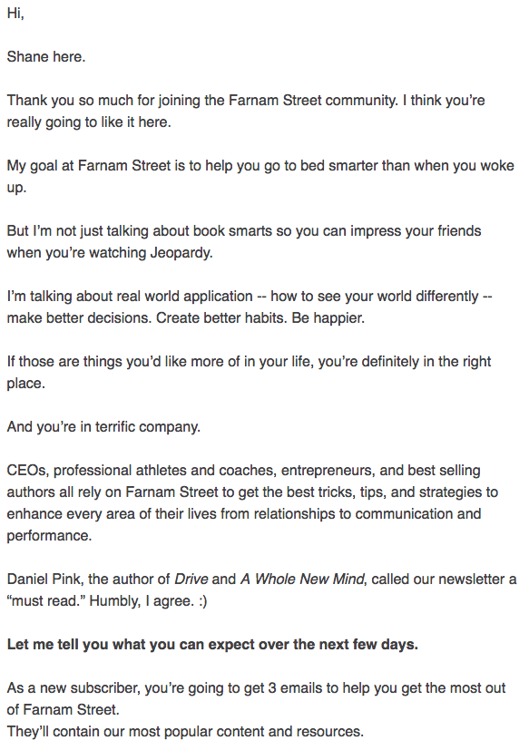
One example I found following this approach came within the Farnam Street newsletter. The welcome email I received from creator Shane Parrish was text-only and included a basic introduction to the content, which clearly follows the journalistic approach.
What I liked about this approach was that it felt personal – and right off the bat, it established a connection with Shane and his material.
2. Plain Text Emails Sometimes Have Better Deliverability.
Another reason I saw more text only emails right now may have to do with deliverability.
Because inboxes like Gmail automatically filter out emails they deem commercial to the ‘Promotions’ tab, some writers have ditched their templates for a more stripped-down, text-only format.
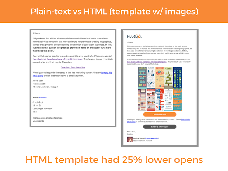
Research from HubSpot shows that emails with many different HTML design elements (like image tags included in templates for gifs and images) are more frequently filtered than emails without.
Even though many marketers send both an HTML and plain-text version to subscribers to help ensure they stay out of the SPAM folder, it doesn’t always make a major impact. Filtering mechanisms of inboxes are becoming increasingly effective at detecting marketing/promotional material, so more and more welcome emails are being relegated to secondary tabs where they don’t get opened, read, or clicked on.
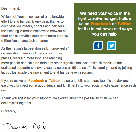
As a result, some organizations are working to strip down their templates to either minimal design elements or none at all. Feeding America was one non-profit organization I saw working within the lightweight design context:
The good news was that it worked: This welcome email landed in my ‘Primary’ tab of Gmail.
3. Plain Text Emails Are Opened and Clicked on More Than HTML Emails on Average
We also have to think about how readers interact with different types of emails.
In one instance, HubSpot research found via A/B tests that emails coded with HTML were opened 25% less than plain text emails on average.
The reason, according to SmartInsights, is that subscribers, like the inbox filtering mechanisms we just discussed, are good at detecting marketing, and glossy HTML templates are a red flag.
The email inbox is primarily used and valued as a space for direct, one-on-one interaction. And that’s what plain text emails look like – a real email from one person to another, not a marketing piece or advertisement.
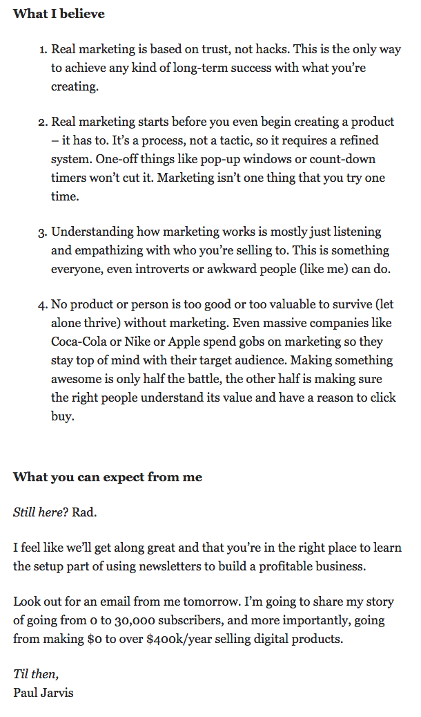
Online instructor Paul Jarvis used this approach in his newsletter welcome email, and it helped establish the person behind the brand:
So, Is Text-Only the New ‘Must’ for Welcome Emails?
At this point, you might be wondering: “Okay, so does this mean I need to ditch my email templates and switch to plain text?”
The answer to that is nuanced. The short answer is: It depends.
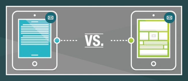
Each newsletter audience is unique, just like the businesses and individuals who write them. The only way to know for sure which produces better results is to conduct multiple A/B tests.
But let’s not stop the conversation there.
Now that we’ve noted the trend and explored some of the potential driving forces behind it, let’s look at some of the other interesting tactics used within these text-based emails that you can work into those A/B tests.
3 Other Notable tactics in Text-Based Welcome Emails
From asking to be whitelisted to using a real person’s name and photo, there were three additional tactics used in these text-based welcome emails that I think are worth calling out:
1. Leveraging the Writer’s Name, Signature, or Photo
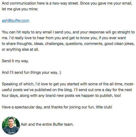
When a real person (the CEO or person writing the welcome email) was the one signing off in the signature line, I felt like it instantly added a human element. The reason: You can now associate this email (and future emails) with a name and face at the company. It’s not just “The team at X Company”, for example.
Buffer, a social media SaaS company, did this well – and they even added a photo, which I liked.
2. Asking to Be Whitelisted
As we discussed, making it into a new subscribers primary inbox can be tricky business.
However, asking to be whitelisted (AKA getting the newsletter added to the subscriber’s saved contacts) helps increase the likelihood your email will end up in the recipients primary email folder (instead of a SPAM or Promotions tab).
I noticed that the New York Times asked new subscribers to take this action within their welcome email – which is a smart way to boost the chances future emails get opened.
3. Onboarding and Introductions
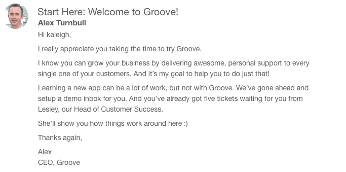
Other brands used the welcome email to encourage efficient onboarding. Support software company Groove automatically sent me a welcome email with simple steps for getting started (and they too used the CEO’s name and photo.)
I liked that there was no lag time during which I had to wait for further instructions – the welcome email came right away. I could jump in with both feet without fumbling around and trying to figure things out on my own.
Final Thoughts
While what I learned seems to make a strong case for a plain text future (or at least its popularity in the moment), my findings were drawn from fairly limited sample size. I looked at 30 different welcome letters within a relatively small set of industry verticals – so it’s important to remember that the outcome here very well may look different when examining a different set of companies and niches.
Should you take my results as hard and fast proof that text-only formatting is the future of newsletter welcome emails? No. You should, however, take it as food for thought in regard to future A/B testing. As you experiment with plain text vs. HTML templates, look to your results and hard data when making any final decisions.
