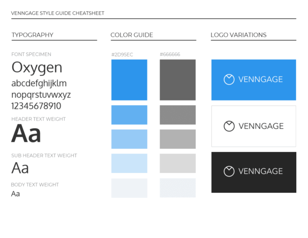
Design terms can seem complicated, especially if you aren’t a designer. However if you’re a small business, or a marketer it’s highly likely you’ll have to use your company brand in your visual materials. Often you’ll be provided with brand guidelines from somebody in the design department, and it’s important to know how to read them.

Venngage Brand Guidelines
Here are the three main parts of branding that you need to understand to successfully, and what some of those confusing design terms mean:
Logos
The most obvious and best known part of branding is your logo. The logo is the graphic symbol or image that is used to identify your brand. Logos can be text, pictures, or both. The thing to remember when designing or picking a logo it’s important to think about how you would scale your logo up or down. That is to make it bigger or smaller.
A logo lock-up means the amount of space your logo takes up. Most brands will have a “horizontal” and “vertical” or “stacked” version of their logo. Having more than one mock logo lock-up is really important to make sure you’re adequately utilizing all of the space in your design. If can also be worth having some versions in different colors too, regular color and a whiteout version are pretty standard. Whiteout is just your logo but in white.
Colors
Color is another vital part of branding. A color palette helps set the tone of your brand and materials. Once you’ve picked one color palette – to be really smart, you should pick another. This is called primary and secondary color palettes – and boy do they change the game. Your main color palette, your primary, should be used for your logo, your website, and any other “master” style documents – like your packaging or your onboarding materials. But the magic happens when you pick a secondary palette. A secondary palette gives you more options to chose from. You could use muted versions of your first palette, or complimentary but bolder colors. Adding a second color palette will increase your potential color combos from 3 or 4, to easily 10 or 12. All the whilst still being “on brand”.
Your primary color palette should contain at least four, but no more than six colors. The absolute must-haves are a dark color, a light color, a contrasting color, and complimentary color. What I like to do when I’m picking a color palette is to put them “into application”, which means to mock up a design quickly and see how they work together. It’s also helpful to identify what your main color will be early on.
Fonts
Fonts often get forgotten about when we’re talking about branding, but they’re just as important as the logo and the colors. Picking a brand font means picking the font you want to use on all of your communication materials. Fonts are the key to consistency when it comes to branded visuals. Sure, all fonts will look good, but remember how we said earlier that consumers expect consistent branding? If you mix your fonts up too much you’ll look sloppy and unprofessional. So it’s making sure you pick your brand fonts and stick with them. What makes a good brand font? A good brand font should be readable, simple, and appropriate for your brand tone. If you’re a medical company trying to cure cancer, it’s probably best to stay away cartoonish looking fonts, ya know?
Picking a brand font doesn’t mean just picking one font and leaving it. You need to think about your font hierarchy and pick three fonts accordingly. Now that’s not to say that you can’t create an effective type hierarchy with one font, you absolutely can. But picking three fonts helps create much more visual interest.
Read more: