What do you think of when you see the Golden Arches? McDonalds.
What about when you see a swoosh? Well, that’s Nike.
What about a red check mark? That’s gotta be Verizon.
Logos are how consumers identify with brands with just a single glance.
Sometimes brands revamp their image, and with that, their logo – but it doesn’t always turn out as planned. In honor of Yahoo’s redesigned logo debuting next month, we took a look at some of the most criticized and unsuccessful brand logo redesigns.
Gap
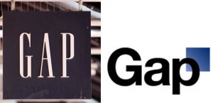
Gap gave itself a pretty big downgrade from its simple, white-on-navy trademark logo when it swapped it for a black, lowercase title with … a floating blue square attached to the end. The change in color scheme was a pretty harsh change considering the previous logo had been around for decades. The team at Gap thought they were making a contemporary change, but reverted back to their original logo after intense backlash from its customer base on social media.
Source: thedailybeast.com
Best Buy
Best Buy has branded itself on affordable appliances – hence its traditional logo of a bright yellow price tag. But in 2008 Best Buy ditched the bright yellow tag in favor of a sleeker, corporate logo. The end result isn’t awful – but it definitely wasn’t as easy for consumers to identify with.
Source: thedailybeast.com
Pepsi
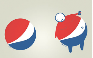
Pepsi is one of the biggest brands in the world, so its logo reaches hundreds of millions of people. And they take it seriously, too – which is evident in this lengthy article outlining the creative process behind the logo change. However, it didn’t go over so great with the public. A lot of criticism followed the change – including many who thought the red, white and blue design looked more like an overweight man with his belly showing. Not Pepsi’s best look:
Source: demilked.com
Animal Planet
Animal Planet is just that – a channel dedicated to all things animal. You could tell that by looking at its best-known logo, equipped with the Earth and a cute elephant. Although a literal interpretation, it is a friendly one that depicts what the channel is all about. The redesign? It’s lost its friendly disposition and its animal recognition. Instead it’s got a sideways “m” – which doesn’t resemble any kind of animal that we can think of.
Source: thedailybeast.com
London Olympics
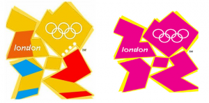
Even though the Olympics can’t technically have a redesign (since each Olympic city gets its own), this is still an honorable mention among most criticized logos. The 2012 London Olympics used the following design:
Source: thedailybeast.com
Unfortunately, a lot of people saw it as Bart and Lisa Simpson getting a little too close to each other.
Some redesigns are hits, and others, like these, are misses – but it solidifies the fact that a logo is more than just a picture. It’s how businesses and brands relate to their customer base in the blink of an eye. Here’s hoping Yahoo has learned from these flops.


