 Your brand logos speak volumes in your home country. Proudly boasting your cool, fresh attitude, they represent everything your company stands for. But what do you do if these logos do the exact opposite in another country? What if your cool, fresh image actually falls flat on the international scene?
Your logos are an integral part of your company brand. A good universal design works well across all cultures. Therefore, it’s important to take your company and product logos into consideration when you’re defining your localization strategy for entering new markets across the globe.
What’s in a name?
If your company or product name is a core part of the logo, you may need to think about whether to localize it for certain markets. Generally, it’s ideal to keep names in the source language to create worldwide brand recognition. However, if your organization’s name doesn’t transcend well into new markets, you may want to consider translating it and maybe even modifying it.
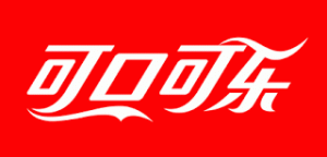
There are many examples out there of company and brand names that have been localized for international markets. For example, Coca-Cola included their company name in their overall localization strategy for China, because the direct translation for Coca-Cola in this language is “bite the wax tadpole.” Obviously this isn’t ideal, so Coca-Cola decided to change their iconic product name to something a little more consumer-friendly for this particular market. The rebranded name they selected translates into “delicious, able to enjoy,” which is more enticing to Chinese consumers. The company also opted to use Chinese characters to present a truly localized version of their logo.
Another example of a company that changed their name (and thus their logo) for a specific country is Glade, although their reason for doing so was much different. The original name is pronounced as “glad” in the Portuguese language. The company decided to change its name to Gleid for the Brazil market because they wanted consumers to pronounce the name the same as in English. In this case, they decided to take a different approach to maintaining their brand identity.
It is important to do your homework to determine if your company and brand names will work well in other countries or need to be included into your overall localization strategy. Good insight to help you make informed decisions around your logo designs and their global effectiveness can be gained by conducting market research in each country your organization plans to enter into.
Images that paint the wrong picture
Names aren’t the only component of your logo to take into consideration when defining a localization strategy. As part of your market research efforts, you should also make sure your logo images aren’t going to miss the mark. You want your logo to strike the right chord with locals—no matter what country they are in—because even images can be interpreted differently from culture to culture.
For example, a USA-based company named RJ Metrics learned this the hard way when their logo—a dodecahedron (a geometric shape with 12 faces)—was declared to look like underwear by buyers in the United Kingdom. Not wanting to be the butt of the joke (sorry, couldn’t resist), the company reworked their logo by changing the angle of design and making the lines thinner so that it didn’t conjure up any more images of undergarments. These minor changes make the logo much more universal across different cultures.
RJ Metrics used global customer surveys to gather feedback on their logo after the issues arose to determine if they really had a problem. If they had done that right from the beginning, they could have saved themselves a lot of embarrassment and extra work. The lesson learned from this example is that you may want to test your logo in new markets ahead of time so, when necessary, you can put out any small fires before they become big problems.
A colorful world
The colors used in your logos are another factor to take into account as you expand your global footprint and plan your localization strategy, as they do not generally convey universal meanings. In Iran, for instance, green is highly applauded and evokes joy and success, but in China this color symbolizes disgrace. Selecting colors for logos can be tricky though. Just because a color is commonly used for a certain emotion, doesn’t mean it can’t be used. It may depend on how superstitious a culture is. This makes doing market research critical to determining if you have an issue or not.
Ideally, you want your brand colors to stay the same, because according to the Color Marketing Group, color increases brand recognition by up to 80 percent. However, if the color is going to create a negative brand image for a particular culture, you may want to address the issue by changing the color.
Another option is to keep your logo colors intact but include more culturally appropriate core colors in your marketing materials and packaging. For example, UPS keeps its logo brown, but its multilingual websites are primarily blue—which is a more neutral choice because it is considered one of the most universally appealing colors.
Logo design that resonates in every language
There aren’t any hard and fast rules for logo localization. It all boils down to making your logo as universally appealing as possible so that you can get that coveted worldwide recognition, without turning heads in the wrong direction. They key is to do your research ahead of time so your organization is not blindsided by a logo design that evokes cultural indifference to your brand.
To learn more about global design, check out this article, “Multilingual desktop publishing: Tips for making your design layout work with translated content.”
Did you include your logo in your localization strategy? What factors did you take into consideration? We’d love to hear about your experience.
