Website design changes constantly, with new ideas evolving as fast as the upgrades in technology. However, one thing that hasn’t changed is the need for responsive design. More and more users are searching solely on mobile devices, which means your site needs to work on desktop, tablet, laptops, AND mobile devices.
If your website adjusts for each device, whether it is a laptop, tablet, or mobile phone, your customers will be happy, and so will Google.
What is Responsive Design?
By definition, from Google Developers, responsive design is design and development that responds to the user’s behavior and environment, based on screen size, platform, and orientation. Using flexible grids and layouts allows images and content to resize based on the size and orientation of the screen.
Responsive design is designing your website for:
- The traditional user on PC or laptop
- The iPad or tablet user
- The mobile user
Adjusting your design to be responsive means that no matter what device your audience is on, the user gets the same content delivered in an experience optimized for that device.
Responsive Design Still Matters
Responsive content and design can work in multiple formats and are not limited to what device is user is on. Your content can be just as responsive as the design. If your user moves from their iPhone to their tablet, they will expect the same usability and readability.
Your audience may not notice when your website works well but anyone will recognize bad design and poor user experience. Anyone who has been on a poorly-designed, non-responsive website will know what that means. You do not want to visit a non-responsive, non-adapted website on your phone and have to pinch and scroll just to find what you’re looking for.
Responsive design for your website is as important to your business as social media. Here’s why:
- A consistent experience can increase lead generation, sales, and conversions
- Analytics, tracking, and reporting all located in one place
- Increase reach to customers on a variety of devices
- Keep up with the competition
- And stay in compliance with Google’s mobile guidelines
To quote Jon-Mikel Bailey, “recognize that your website is the hub of your front-facing communications efforts. It’s the central repository of your content marketing, and it is the place where your clients, members, and fans look to interact with you directly.” The user experience must be seamless or you are making a bad impression.
Beyond the Basics
In 2015, Google announced that mobile-friendliness and responsive design would be a ranking factor for search engine algorithm. So, if impressing your audience was not enough, Google said that not keeping up with the times (and the technology) would negatively impact your SEO and rankings.
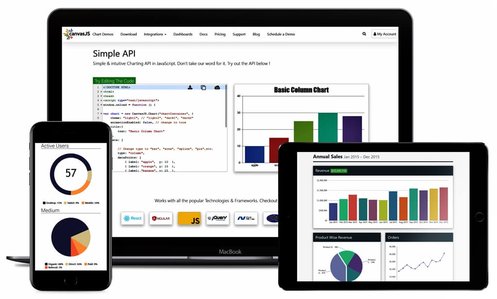
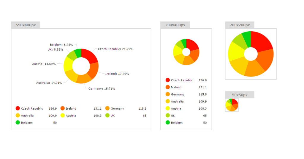
Responsive design is not limited to moving images around and changing layouts. Adjusting your content to reflect the changing layout is just as important. Additionally, images may or may not display well on a smaller or larger screen, so change images as needed for each screen size. This image below demonstrates adjusting images for each…
To Mobile or not to Mobile
Even in the age of social media and the cell phone, not everyone is using their phone for everything. Think about what content should and shouldn’t be on a screen the size of a mobile phone. Images and other content may look different on a phone than they would on a computer.
Responsive content along with the responsive design will make sure your audience gets the most out of their time on your site.
If you are unsure where to start when it comes to responsive design, start with these three basics:
- Readable text without requiring zoom
- Room to tap; space for tap targets
- No horizontal scrolling
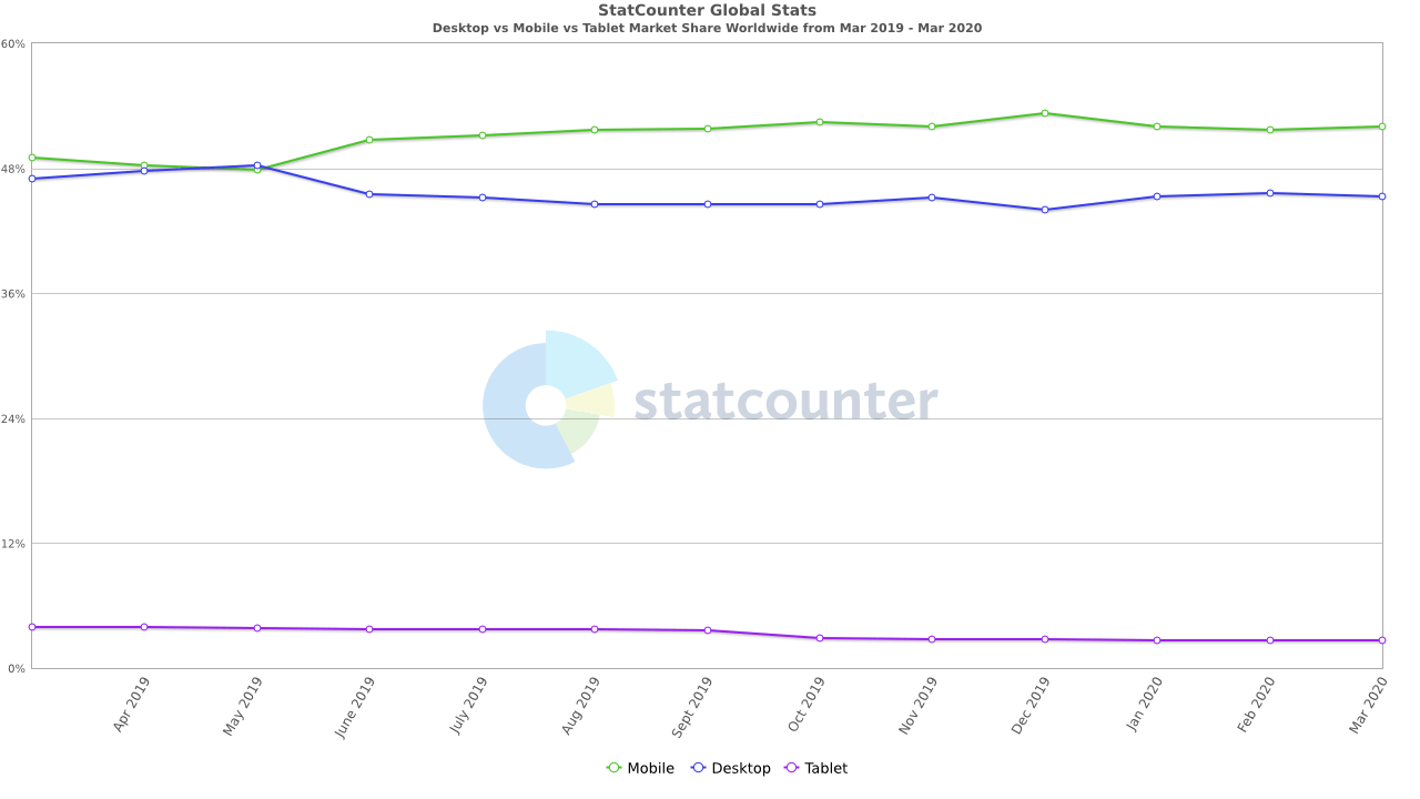
As you can see in the chart below, mobile has eclipsed desktop but desktop hasn’t gone away.
Use responsive design so your website can anticipate the needs of the customer before they even realize it. The customer will appreciate your attentiveness and willingness to keep up with the times.