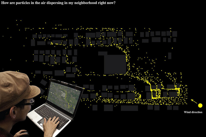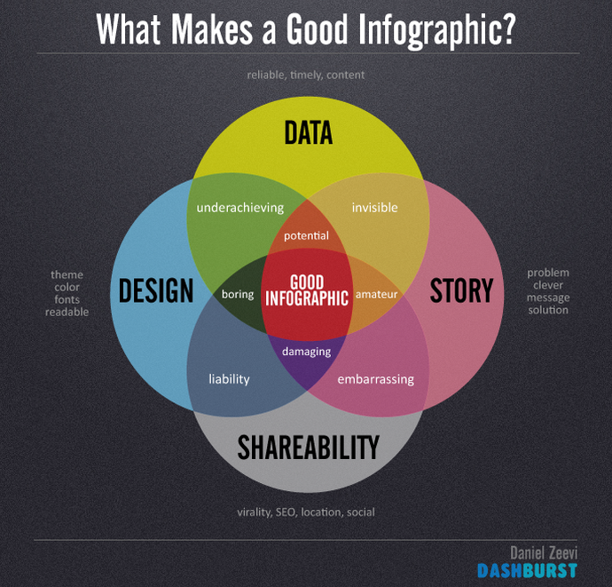
Statisticians look for clarity in numbers. Artists understand how color and shape appeal to, and influence, people. Marketing professionals can combine the clarity of numbers with the appeal of graphics, using data visualization (DV) tools.
If you’ve ever used a spreadsheet or presentation program, you’re probably familiar with the simple graphic tools they contain for creating line graphs, bar charts or pie charts. DV tools combine that simple approach with the power of graphics software to create much more sophisticated displays. By mixing data with charts, maps or pictures, and allowing the variables in the data to be changed, DV tools create powerful narratives that can show success stories, highlight customer attitudes, reveal gaps in sales penetration, show trends and much more. In short, DV tools provide structure by turning data sets into stories, tales that help people to gain an intuitive grasp of the underlying statistics or theme of the presentation or report.
A wide range of DV tools are now available for use. Most business intelligence and analytics packages will contain some ability to present and report on data in a visual format. In addition, there are stand-alone DV software offerings that provide additional graphics options (such as maps and word tables), and also offer interactive options for changing variables during a presentation.
Data Visualization presentations can meet a wide variety of marketing needs
Data Visualization Examples:
– A marketing consultant combines his client’s equipment sales data with competitors across a national map. The client could visually grasp how its sales efforts were faring against the competition in specific regions and with specific equipment sectors in those regions. The result, a visual narrative of the company’s sales successes and challenges going forward.
– A museum analyzed an e-mail publicity campaign’s penetration by creating a chart showing the demographics of return visitors who had received the message. The graphic provided easy visualization of the campaign’s effectiveness by age, family status, and location. The results allowed the marketing team to tell the story of which target audiences responded to e-mail overtures, and how to incorporate it into future museum outreach efforts.
– An investment firm wanted to track new asset growth by client status (new, existing, most valued), and demographics. To help analysts quickly comprehend the information, DV tools were used to create a dashboard that showed overall assets, with a range of commands that allowed users to select or remove specific sub-sectors in order to view the data with more precision. The resulting narrative gave analysts hard data along with a visually-enhanced feel for who their investors were, and how much each investor segment currently contributed to company growth.
Of course, creating a story out of data requires a little more than creating a bar chart and projecting it on a screen. Author and DV expert Ben Fry suggests these seven steps:
1. Acquire the Data
This is the most straightforward step, but bear in mind that the decisions made while gathering and including data will affect the outcome of the entire narrative. At this stage, it’s probably a better choice to include rather than exclude numbers. A chance to refine and omit data comes later in the process.
2. Parse the Numbers.
At this point, the raw data needs to be structured so any underlying meaning can be uncovered. A simple approach is to sort the data into categories, and then create sub-categories as needed.
3. Filter the Categories
At this point, the general data pool will probably contain information that won’t be relevant to the end presentation. Some numbers will be obvious candidates for deletion, while others can require a judgment call: Can the data be removed without diminishing the impact of the final presentation?
4. Mine the Remaining Statistics
At this point, you can see which of your categories and sub-categories contain substantially interesting or insightful data. Pull these as the basis for your DV presentation.
5. Represent the data
At this stage, it may be clear what the most effective visual model is. Remember to let the data drive the choice of a model, rather than fitting the numbers into a predetermined graphical format.
6. Refine the graphic
Once you have the data in graphic form, look for areas that should be emphasized through the addition of color, shapes, size or shading.
7. Create interactivity
Provide your audience with ways to manipulate the data.
It’s human nature to respond to a story. By creating narratives out of static numbers, DV tools offer the opportunity to create presentations that provide insight, are easy to follow and help to energize any marketing presentation.
Here are some of the top tools for Data Visualization:
Tableu – Often noted by many large companies as one of the top data visualization tools, Tableau allows users to easily create a plethora of interactive visualization types. You can upload your data in a spreadsheet or CSV to create a variety of customized bar charts, Venn diagrams, line graphs, pie graphs and even an assortment of heat maps to show density in a given situation. The only downside for Tableau is it is not web based and the tool can only be used with Windows operating systems.
MicroStrategy – Available in cloud based software and used by many companies at the enterprise level, Microstrategy has now become one of the leaders in enterprise data visualization and business intelligence software. It is utilized by companies such as Groupon, The Hard Rock Cafe, HerbaLife, Ebay, Novation, Campbell’s and The Container Store, just to name a few.
Easel.ly – This is a free web based tool, generally used for conceptual visualizations and brand or data storytelling. It is also more geared to creating unique infographics and has a wide variety of graphics and objects to choose from.
Infogr.am – This DV tool is geared toward using real data to create a multitude of graphs and charts. They have a wide variety of free options to choose from when deciding how to display your data and that comes in the form of location charts, bubble charts, radial bar graphs, scatter plot charts and many more.
Visual.ly – This tool is definitely geared toward visualization and graphics. Many use this tool show an analysis and relationship between two data sets such as Twitter and Facebook. It also lets you create Venn diagrams to show relationships between different sets of data.
Datavisualization.ch – Can be a little more complex to use, but has an excellent assortment of data visualization wire frames and charts to create more advanced and interactive data visualization presentations.