One key point about online usability that I always emphasize is the importance of keeping the conversion process easy for users. Avoid distractions. Don’t irritate or frustrate them. Make the conversion funnel feel as brief and smooth as possible. This doesn’t mean that every process should be as short as it can be; rather, it should be “as short as necessary while still being effective.” Users require information, trust, and confidence, and it’s essential to provide these in a straightforward and efficient way to promote a conversion.
Let’s learn from Disney. They can’t allow every visitor at their theme park to walk straight onto every ride. Waiting is a key part of how they operate. However, they don’t create a long line that stretches around half the park, blocking your view of the ride you want to try. Instead, they wind the line around, provide estimated wait times, and add fun distractions along the way. They even created Fast Pass to help reduce your waiting times. Essentially, they don’t really cut down your wait; they just make it FEEL easier. And that keeps people happy.
This approach translates well to conversion funnels. It tells us that multi-step forms might be good, but be sure to inform users of their progress along the way. Break up tasks into chunks when possible, but not in so tedious a way as to frustrate users. Sure, Disney visitors will get the Fast Pass, but I imagine most would just roll their eyes if you could get a Faster Pass to get your Fast Pass quicker.
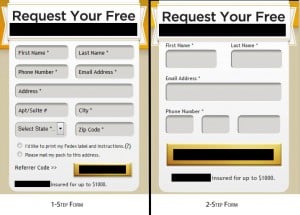
I’ve often wondered the actual effect on conversion rates of multi-part forms, and recently I was given a very basic opportunity to find out exactly that. A fairly simple site with one objective: get users to fill out a form to request a mailing. This simplistic setup really made the comparison quite direct. The form is located on EVERY page of the site, very prominently, as you will see the actual sizes in the image below. So, the question is: which form performed better?

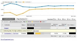
The results? Users greeted by the friendly 4-field form were not only more likely to fill it out, they were more likely to finish the entire process as well. As a matter of fact, 14% more people finished the 2-step form than finished the 1-step form (94% confidence). This doesn’t even include the people who abandoned after the first step of the 2-step form (about 12% of those filling it out), so follow-ups that are able to convert make the difference even more dramatic.

Why did it happen? Without diving too far into our psyche, as that’s well outside my area of expertise, I imagine it’s because shorter forms are less daunting. It just SEEMS easier. It may be largely subconscious as well. Obviously, if people know they are submitting a request to be mailed information, they must realize they’ll need to enter an address at some point. But those simplified fields and big text just look so welcoming and easy.
So does this mean you should go break your forms into two steps? No, not necessarily. As I mentioned earlier, this was “short yet sufficient” for this particular website. If you’re selling $65k automobiles moving the e-mail address to the second page of your form is likely a misguided attempt at conversion optimization. Am I going to push to turn this into a 3-step process now? No. I can’t even think of a way to split it up without having users roll their eyes at me.
The takeaway: break the steps of your conversion process into the most reasonable slices as you can. If forms are as simple as is sufficient, you’ll see increasing form completion percentages and ultimately conversions. Not to mention starting the conversion process by getting an e-mail address can be very valuable in converting abandoned visitors (which is a discussion for another day).
Do you have a website that is ripe for testing? Want to discuss strategies or results that you’ve had? Leave a comment or shoot me an e-mail.