A lot of people out there seem to think that larger, more complex websites cannot possibly benefit from a responsive web design, or RWD. Well I am here to tell you that is simply not true. Responsive web design can be used as a tool to help any type of website become more usable across device sizes. No matter what kind of site you have, you need to realize that your customer is no longer always behind a desktop. Sure mobile apps are useful, but managing two separate websites, or a website and a native app, can be time consuming. Here I explore eleven brands in the financial industry that prove RWD can work for much more than just small businesses and blogging sites.
1. Gateway Bank of Mesa, AZ
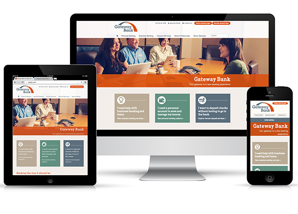
Gateway Bank in Arizona was one of the first financial institutions to implement a responsive web design. I think this is a great example of how a traditional brand, like a bank, can use modern design to really connect with its customers. This responsive site uses good content hierarchy to show users the most important content elements regardless of screen size. I also appreciate that the links remain obvious and easy to click at the smallest screen. Overall, I think the effect is modern and conveys this bank’s uniqueness.
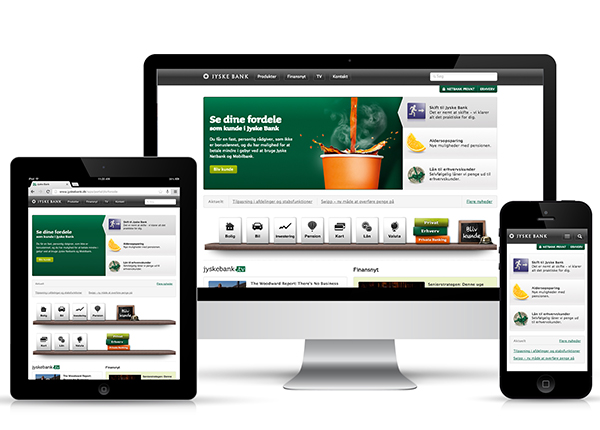
This Dutch banking site is evidence that a very large site can still be made responsive. Jyske Bank realized that a great deal of its customers were using the company’s old site on a mobile device, despite not having it optimized for smaller mobile screens. Clearly their new approach is much more focused on a mobile user experience with very clear navigation systems and links built for touch. I do feel that some of the design has been sacrificed on the smaller screens, but for a customer who wants to do their banking from a mobile phone, this is quite useful.
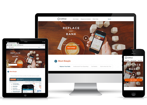
The mission of Simple Bank is to provide customers a very non-traditional banking experience. One of the main services of Simple is its mobile banking feature, so it’s not very surprising that the company’s website has been designed with a mobile experience in mind. What I really like about this site is that it has a very consistent design as the screen resizes. Obviously, these designers thought about the mobile experience before the desktop.
This crisp, clean site was definitely designed to provide a simple experience for customers. Even on a tablet size, the content has been arranged to allow users the best mobile banking experience possible. I really like how the footer navigation system links are changed to accomodate for touch as the site is scaled down. Though the tablet and smartphone-sized versions of this site may not be the best for someone shopping around for a new bank, they are certainly useful for current customers who want to utilize the mobile banking technology.
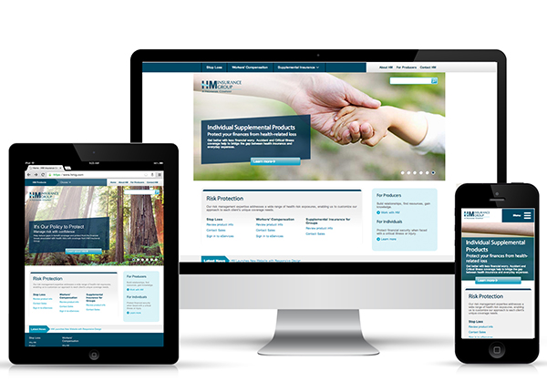
HM Insurance Group just recently launched this responsive website. It’s a really good example of how a larger site can still be made responsive. The HM Insurance website operates as a resource hub for users; though it may have been daunting to approach a RWD for a site with so much content, they managed to create something quite useable on small screens.
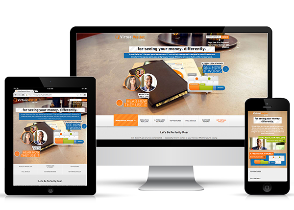
Now the PNG Wallet website illustrates an interesting approach to responsive web design that I am not necessarily totally on board with. I notice going through some of the inside pages of this site that a lot of design elements change as smaller screen sizes are detected. Most of the background images disappear, and the headers are given styling that doesn’t exist on the desktop version of the site. But other than that, I have to say, I really enjoy this bright, modern web design and the fact that considerations have been made to make it phone and tablet friendly.
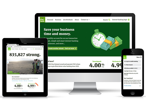
Kiwi Bank, located in New Zealand (no shocker there), makes great use of typographic elements to keep its design consistant across all devices. Like a few of these other sites, priority is given to tasks like logging in to mobile banking and locating a branch as the site reaches smartphone size. However, unlike others, I think the small screen version of this responsive website is a useful tool for attracting new customers as well as catering to those which already use Kiwi Bank.
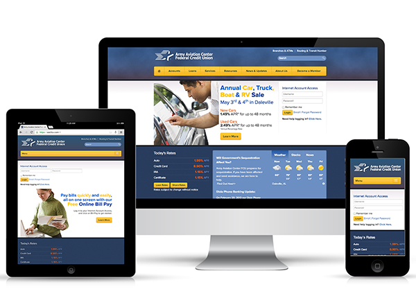
8. Army Aviation Center Federal Credit Union
Despite losing some design elements on the small screen, I have to say that AACFCU really thought about what users would want from their smartphone experience with the site. On a large screen, the homepage displays a few large images which rotate, but on a small screen, you simply see the login and password fields. This makes a lot of sense for a site that wants to optimize for mobile banking. The content here is exactly the thing a mobile banking customer would want to see first.
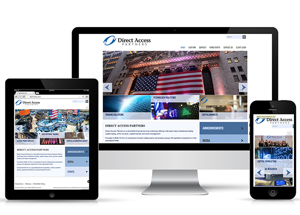
Overall, the responsive web design used on the Direct Access Partners website is very sleek and modern; moreover, the look and feel of the site is very consistant across devices sizes. My main issue with this site is the navigation system which features a huge drop-down menu at the smallest screen size. Though a drop-down menu with an icon is a good way to approach navigation at this size, with so many links, it can be difficult to actually click on with your finger.
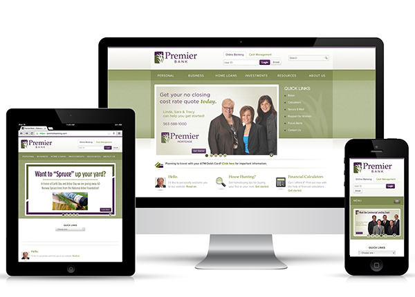
I like the way the navigation is changed on the Premier Bank site to accommodate a smartphone user. When the window gets smaller, the main horizontal menu becomes a single tab that can be tapped for a vertical list of choices while the quick links menu becomes select menu.
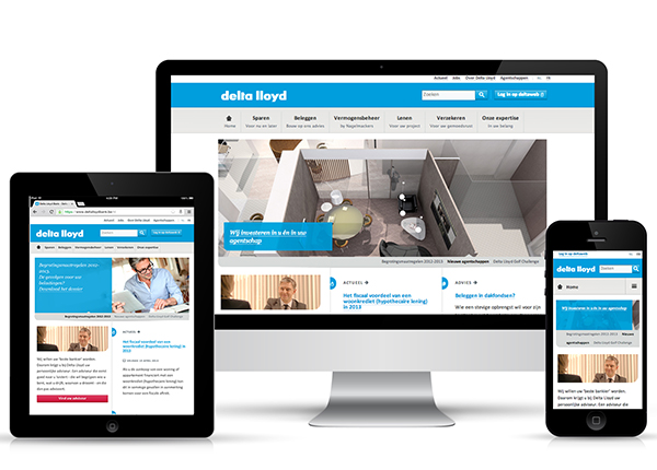
Last, but certainly not least, we have Delta Lloyd. This is a wonderful responsive web design that I feel encompasses a lot of the elements of basic web usability. Take one look at the clickable-looking buttons, the easy navigation, and the careful thought given to content hierarchy, and you can tell instantly that this site was created “mobile-first.” I know that no matter what device I choose to access this website from, I will have an identical experience with this brand.
Whether your website is very large or very small, very simple or very complex, you can make a responsive web design work. No matter what industry you are in, you very likely have customers and prospects who wish to engage with your brand from their smartphones and tablets. Make sure you don’t miss out on this valuable interaction just because your site isn’t optimized for small screens and tablets!
Read more:
