What’s the worst that could happen? I know that we’re all guilty of asking ourselves that question. However, when it comes to data visualization, one that’s less-than-ideal could have far greater negative ramifications than you may think.
“When visualization is done poorly, it can often read as propaganda,” says Visually’s Visualization Architech, Dew Saku in a recent article from the Visually Blog. One of the goals of an organization is to establish a bond between the visualizer and the viewer. A poor visualization can damage this trust, and as Saku so aptly points out “visualizations intended to convey information end up conveying dishonesty and hidden intentions.” Don’t believe me? Well, let me show you a few examples that really drive my point home.
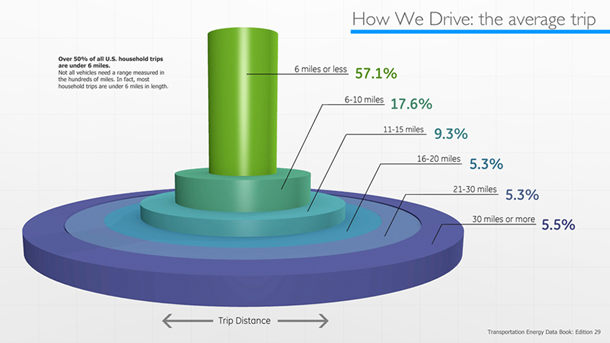
For example, how about we look at and use General Electric’s How We Drive visualization as a case study. Unable to figure out what going on in this visualization? You aren’t alone. According to Saku, this visualization is “not even worth looking at if you want to see the data.” While this section of GE’s data visualization may look cool, the data on display here “has a part to whole relationship, however the visualization does not show it.” Instead of focusing on the part to a whole relationship, the designers decided to showcase trip length. In an attempt to show off both trip distance and percentage, the designer decided to use a 3D visualization which ended up complicating the visualization. Instead Saku points out that “a simple bar chart could have communicated both distance and percentages” or a stacked bar or pie chart. These help effectively communicate the part to whole relationship.
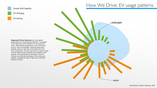
Let’s turn our attention to just one more example. Again this one is pulled from GE’s How We Drive visualization. For starters, the format used here is very difficult to read. Radial charts are always tricky to pull off. When using that format, it’s important to make sure your design team follows industry best practices. The one above however, does not. If we look at this visualization, we can see that there are no radian lines to indicate time – although they did point out noon and midnight – making it very difficult to read. My biggest gripe with this visualization is the overall lack of labeling. Not being able to decipher numerical quantity makes it a very confusing and frustrating visualization. How do you know what you are supposed to be comparing? Saku takes a stab at answer ing this question by assuming that “the bar charts are compared to a blue blob area that it would seem is a radial area chart, however the zero point of the area chart is apparently different from the zero point of the bar charts because there is no central circle on the blue area.” As if that wasn’t confusing enough, the EV Charging, EV Driving, and the Excess Grid Capacity, bars don’t have center points, so for all intensive purposed the only thing we can tell is that the center of it is very far off.
Now ask yourself did these visualizations give you an accurate depiction of the data? Did it help create a feeling of trust between you and the organization? Do you leave here trusting GE?
Data visualization is an extremely powerful tool. If properly executed, they can be very rewarding. However, a poorly done visualization can end up being far more damaging than no visualization at all. Even if there is no malicious intent, poor visualizations can weaken the trust between consumers and firms. As viewers’ visual literacy increases, they will naturally become better at spotting poor visualizations – so make sure your designers are adhering to industry best practices. The lesson here is simple: if it’s not done right, then it’s not worth doing.
Image Source: www.iStockphoto.com

