Crafting great calls to action (CTA) is both a science and an art. Successful CTAs require certain characteristics and careful execution. If you haven’t taken the time to carefully craft your CTAs, you are doing your marketing a disservice. Below are nine factors to consider when designing your CTAs.
1. Tone:
What is your language saying? Does it urge your readers to click, or does it turn them away?
Evaluating the language of your CTA is crucial. If your CTA does not encourage the reader to click, then what’s the point? With the wording, you can put emphasis on the value of your offer, or even create a sense of urgency. Make sure you are putting the answer to your visitors’ problem in your CTA. Your offer is their solution, so present it as such.
2. Colors:
Are you thinking about what colors appeal to your target audience? What about which colors best identify with your offer?
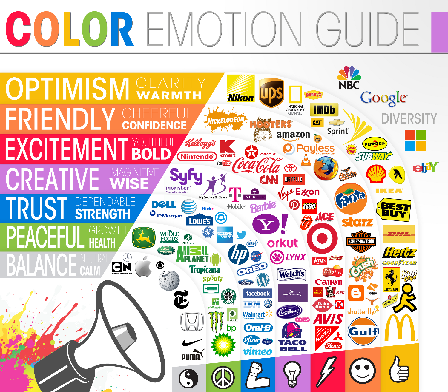
Did you know there is real science behind colors in marketing? People are affected by colors and studies have been done to determine the characteristics and feelings typically triggered by each color. The Logo Company put together this graphic to breakdown characteristics, colors and companies. As you can see, these brands are categorized by their colors and there are specific adjectives for each color. You can use these adjectives to decide which color would best resonate with your CTA and offer. Here is a list of more characteristics for each color and what each is best for. Also, make sure you are using contrasting colors. You don’t want your text to get lost in your CTA.
3. Size:
How big is your CTA? Can your audience read it?
Make sure your CTA is large enough for your readers. If you have a button on your CTA for your visitors to click, make sure the text on it is large enough as well. It is crucial that all elements on your graphic are clear and easy to read.
4. Value:
Does your CTA communicate how much your offer is worth? Does it attract your audience?
If your CTA doesn’t tell your visitors why they need it, it won’t be successful. You know your target audience needs this content, but do they? Your CTA is likely their first chance to decide. Whether you use statistics, eye-catching adjectives or relevant images, make deliberate choices to communicate the value of your offer.
5. Placement:
Where is your CTA located? Is it helping you nurture leads? Are readers even seeing it?
The placement of your CTAs is crucial to your lead nurturing campaign. Think strategically about what pages you put your CTAs on according to the inbound marketing funnel. Nurture your TOFU audience with MOFU CTAs and content offers. Do the same with your MOFU audience by offering them BOFU content. Evaluate the value proposition of each CTA and content offer to match them appropriately.
Another tip: Keep your CTA above the fold. This way, your readers will see the CTA immediately. Also, for longer articles or pages, put another CTA at the bottom as a reminder.
6. Graphic:
Is there an appropriate balance of text and images? Is your image relevant to the content?
Make sure your CTA is complete with a good balance of text and images. You don’t want either to be overwhelming. An eye-catching graphic paired with short, easy to read text will attract interest. Also, you need to make sure that both are 100% relevant to your CTA. Nothing lowers the efficacy of a CTA faster than irrelevant information or images.
7. Branding:
Is your CTA loyal to your brand?
Consistent branding throughout all of the content published on your website is a subtle, difference-maker. Work to integrate information about your company throughout your content and subtly into your CTAs. For example, integrating the company logo, font or coloring is a possibility. This consistency reaffirms your brand and your thought leadership.
8. Theme:
Do your CTAs present the theme of your content? Are the images consistent through the CTA to the landing and confirmation pages?
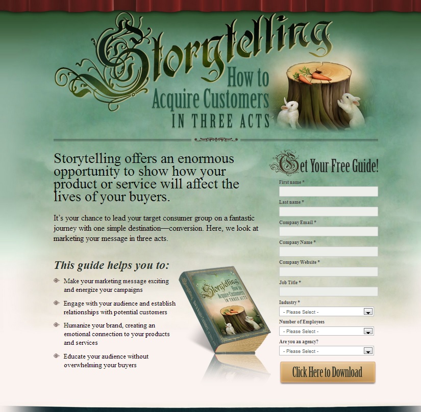
As with branding, a theme should be consistent throughout your marketing campaign. Kuno Creative does a great job of this with their content offers. Work to integrate elements of your theme into every part of your marketing campaign from the CTAs, to the landing pages to the content offer itself to the thank you email. Here is an example from their campaign for their eBook, “Marketing Storytelling: How to Acquire Customers in Three Acts”
First is the CTA for the eBook:
Next is the landing page:
Finally, the thank you page:
Each one of these pages and elements is specifically designed to follow the format of the content. This consistency is beautiful and pleasing to the eye. Start this pattern with your CTA to impress and please your audience.
9. Tangibility:
Do your readers have any idea what your content looks like? Would you buy something without knowing what it looks like?
Show your readers what you content looks like from the start. Making the intangible, tangible could solidify the decision-making process for some of your audience, making them more apt to download your content. In other words, if you have an eBook, put an image of the cover on your CTA to visually convey the value proposition. If there are barriers to consumption for your content, make that barrier seem a little less restrictive with an image of your content offer on your CTA.
Remember your target audience is a specific group and certain factors will resonate better with them than others. Multivariate or A/B testing will help you find what works best with your audience. When you are trying out a brand new CTA, you can test out a few extremely different versions to find out what will work best. After you have determined a clear winner among your options, test one attribute at a time for further improvement.
Compelling CTAs make all the difference in a marketing campaign. A relevant, engaging call to action entices your reader and presents them with something they need—your offer—without sounding or appearing sales-y. Evaluate these nine characteristics of your CTAs to improve click through rates and lead generation.


