With much of today’s marketing and advertising focused on personalization, it’s no surprise that Google Analytics improved its interface to make the dashboard more user-friendly. Earlier this month, several changes were made, all aimed at making Google Analytics simpler for users and offering a more cohesive layout for tools within the platform.
Customized Dashboards
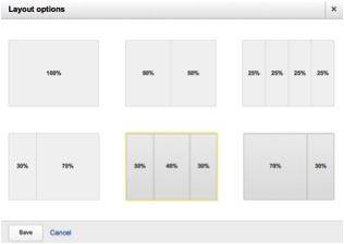
A major improvement to the new Google Analytics platform is that it allows users to create custom dashboards. This provides many more choices for how the dashboard is arranged and how users can view their data. With this update, Google Analytics now offers several options for selecting the ideal layout for you.
What is nice about the new personalized dashboard is the added feature that you now have the ability to share them with others. This feature allows users to have their dashboard seen by others, such as stakeholders, marketing directors and IT managers, and export a personalized view to each, based on what data their department needs.

New Dashboards Widgets
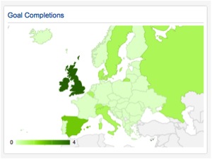
Two new widgets have been added to the updated dashboards; Geo Maps and Bars. Within the Geo Maps widget, users are now able to color code by country, state, etc. While the Bars widget provides more advanced graphing of data.
Updated Navigation
Fewer tabs now line the top of Google Analytics. This is yet another change that’s been implemented to provide a more powerful dashboard to users. Reporting, Customization, Admin and Help are the only tabs now listed atop the dashboard. This area has been cleaned up, moving some of the tabs to the left sidebar, which makes for a more unified placement of tools.
Another neat addition to the new Google Analytics interface is that the top orange navigation bar now floats with the page. So rather than being a static component on each page, this bar now scrolls down along with the user.
Advanced Segments Added to Dashboard
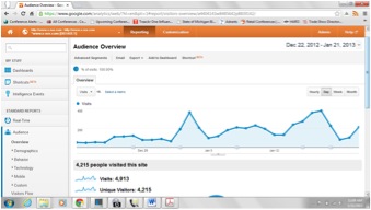
The updated Google Analytics interface now provides Advanced Segments as a feature on the dashboard. This tool is nothing new to the platform, but with its move to the dashboard, again, makes for easier gathering of specific data for users. So, for example, those interested in looking at paid traffic performance versus organic traffic performance can click on the Advanced Segments button (upper left corner of the dashboard, near Audience Overview in standard Google Analytics dashboard layout), select two options you’re interested in seeing reports on, and hit “Apply” to review the data.
As you can see, there have been some pretty simple, yet beneficial changes to the Google Analytics interface. This comes as a pleasant revision to the already highly useful platform.

