SAP Business Objects 4.x provides a variety of visual presentations to represent your data with charts in Webi (Web Intelligence). This entry is part one of two and will cover the steps on how to create charts in Webi using three different methods:
- Turn Into
- Insert
- From the Report Elements tab >> Chart sub-tab
Part two will cover using the Insert a report element screen and the Short-cut menu for charts. The examples in these blog posts all use the eFashion universe. Note: When you export a Webi document that contains a chart to Excel, the chart is converted into an image.
How to Create Charts in Webi
As with many functions in Webi, there is more than one way to create charts.
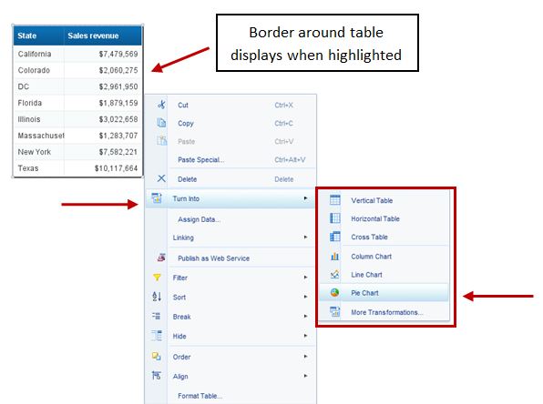
- Turn Into: Start with an existing table and use the Turn Into function
a. Highlight the table, right-click, hover over or click Turn Into, then select from the drop down list.
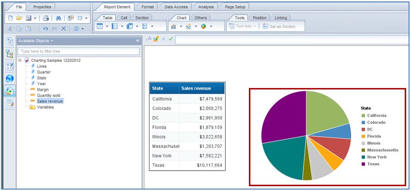
b. This example uses a Pie Chart.
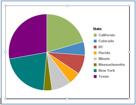
c. The resulting Pie Chart.
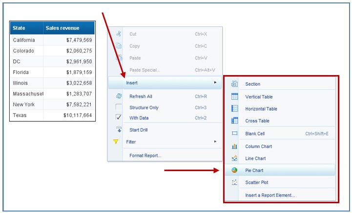
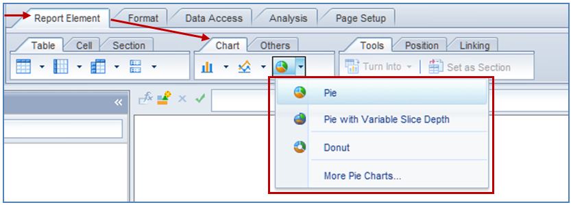
- Insert: Create a new chart in a report
a. Right-click on the report, hover over or click Insert, then select a chart type from the drop down list.
b. This example uses a Pie Chart and will go over the steps to re-create the same chart that’s in #1.
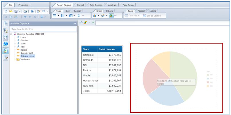
c. Your curser will turn into a large plus sign (+) with an image of the chart type chosen. Click anywhere on the report to create an empty chart at that location.
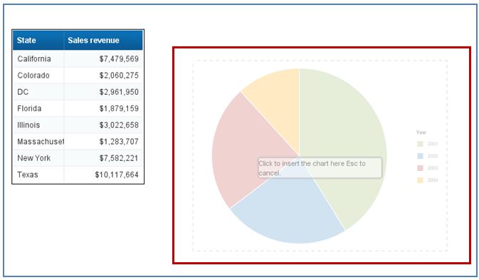
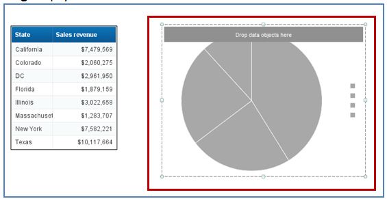
d. The resulting empty Pie Chart.
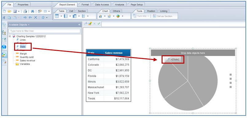
e. Next, simply drag-and-drop the fields you want to display from Available Objects onto the empty Pie Chart. In this exercise, the fields are State (a dimension) and Sales Revenue (a measure).
f. This image shows the pie chart while the State field is being added to the empty chart.
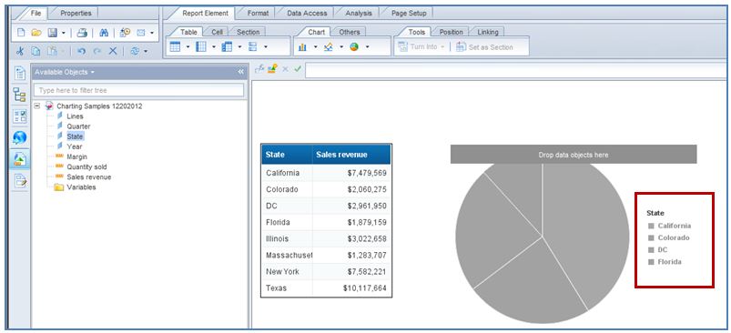
g. This image shows what the pie chart looks like after the State field has been added.
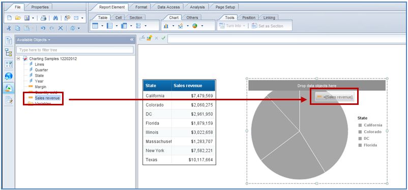
h. This image shows the pie chart while the Sales Revenue field is being added to the chart.
i. After the Sales Revenue field is added, the resulting pie chart will display as shown below.
- From the Report Element tab >> Chart sub-tab: From this sub-tab, click the icon of the chart type you want.
a. Your curser will turn into a large plus sign (+) with an image of the chart type chosen. Click anywhere on the report to create the chart at that location.
b. Next, simply drag-and-drop the fields you want to display from the Available Objects onto the empty Pie Chart as you did in #2 using the Insert method.
So, there you have it – the steps to create charts in Webi using three different methods! Which method do you expect to use the most often? Be sure to go over How to Create Charts in Webi (Part 2 of 2) next week because it will cover useful information about using the Insert a report element screen and the Short-cut menu for charts. And drop Mantis an email if you would like one of our consultants to help your company get started with WebI and charts.