Branding is the process of creating a unique and memorable image for a company in the mind of consumers. One of the most powerful ways to do this is through visual branding.
Visual branding has five key elements – consistency, logo, typography, color, and imagery. We’ll walk through these five elements, as well as go over some examples of companies who excel at visual branding.
1. Consistency is Key
The number one thing that makes good visual branding is consistency.
This means: using the same logo and fonts across all products and marketing materials, sticking to a color scheme, and even using similar imagery online and offline.
Consistency is what establishes a brand in the mind of consumers – seeing a logo over and over again helps consumers recognize and trust a brand. And hopefully, they’ll associate good feelings with that brand.
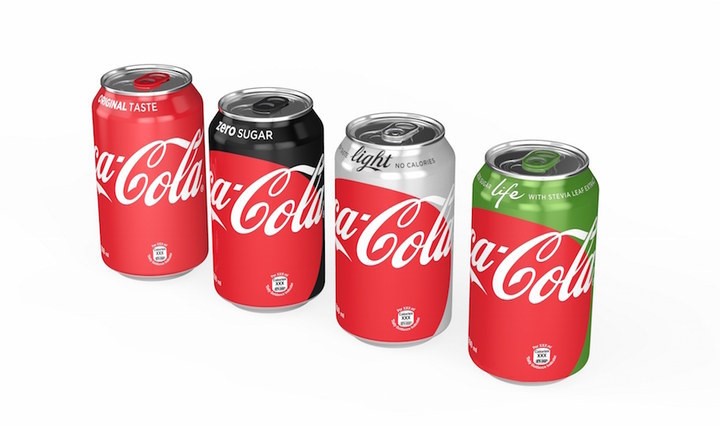
Coca-Cola is a master of consistent branding.
The company has had the same logo since it’s creation in 1886, and fire-engine red is inherently associated with their classic product. The logo and red show up in every ad, on every bottle of soda, and on their online presence. And starting in 2016, not only do cans of classic Coke, Diet Coke, Coke Zero, and Coke Life share the logo and red color – they share a consistent design.
2. Logo
A great logo that can be used on products, online, in print materials, and more, is essential to every business, no matter the industry. Logos are generally the first thing consumer associate with a company, and can help them decide whether or not to purchase a product.
What goes into a great logo?
Most companies have a primary and secondary logo. The primary logo is the one that is used the most – on websites and products.
Having a secondary logo isn’t absolutely necessary, but can be nice to use in place of the primary logo on swag and social media. Generally, the secondary logo is part of the primary logo, or a symbol inspired by the primary logo.
One very important thing to remember when choosing a logo: while the logo may typically be shown in color, it is essential that it also work in plain black and white.
There are so many times a logo will need to be used in black and white, such as on other websites, certain graphics, and even faxes (old school, we know).
Nike is an example of a company with a fantastic logo.
Their primary logo is Nike with a swoosh symbol, and both Nike and the swoosh can (and are) used by themselves. Their logo also looks great in both black and white, as well as any other color.
3. Typography
Consistently using the same fonts for print and online materials is essential for good visual branding.
It may seem small and unimportant, but using the same fonts is just as important as using the same logo.
Most companies opt to have a primary font, that is used for headers and titles, and a secondary font that is used for paragraph text. These fonts can be part of the same font family, or they can be different. One or both can even be from the same font family as the font used in the logo. It can also be useful to have a third font that is used for phrases that need emphasis – in this case, the font is often an italicized or bold version of the primary or secondary font.
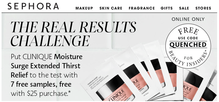
Sephora does an excellent job at consistently using the same fonts.
In their email marketing, the primary font is an all caps italic serif, the secondary font is a clean sans serif, and the third, emphasis font is a bold version of the secondary font.
Check out our blog on fonts to amp up your designs.
4. Color
Color is one of the most important aspects of visual branding.
It is one of the easiest things for consumers to associate with a brand, and different colors convey different feelings – which can be handy for creating desired reactions to products.
Generally, a company will have 1-3 primary colors and 2-3 secondary colors. It is also completely acceptable to just have one primary color. It can be helpful to consider color theory when determining the best colors to use for a company.
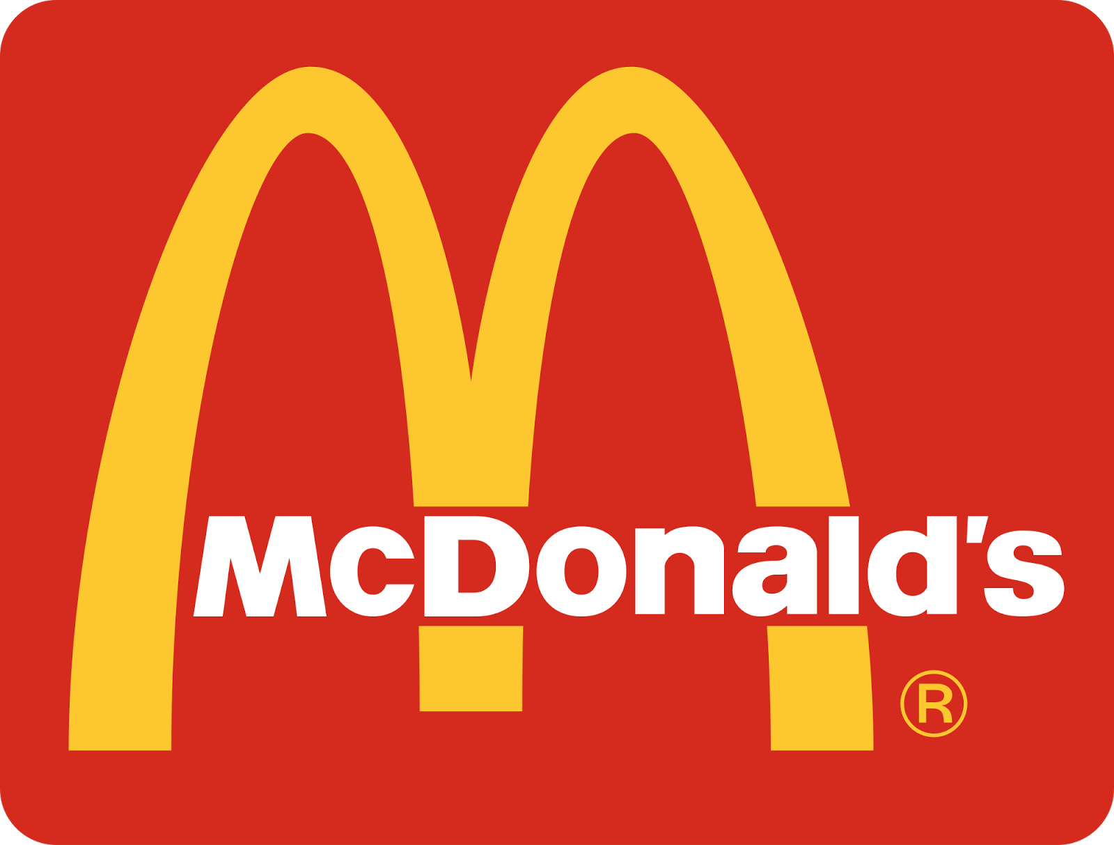
McDonald’s is a prime example of a company with one primary and two secondary colors.
Their primary color is canary yellow, and their secondary colors are fire-engine red and white. Consumers definitely associate the iconic yellow arches with McDonald’s, especially when thinking of fast food.
5. Imagery
While not necessarily as important as logo, typography, or color when it comes to visual branding, using consistent imagery is another powerful tool.
Imagery refers to the pictures and graphics that a company uses in their ads and online presence.
Choosing the right imagery is a great way to show consumers what the company is all about.
Imagery can convey the lifestyle that comes along with using a product. It can also help target the right market for a product, by visually showing consumers that the product is a great fit for their lifestyle and interests.
The key to choosing good imagery is to know your target market and choose imagery that is going to resonate with them – then use similar imagery consistently.
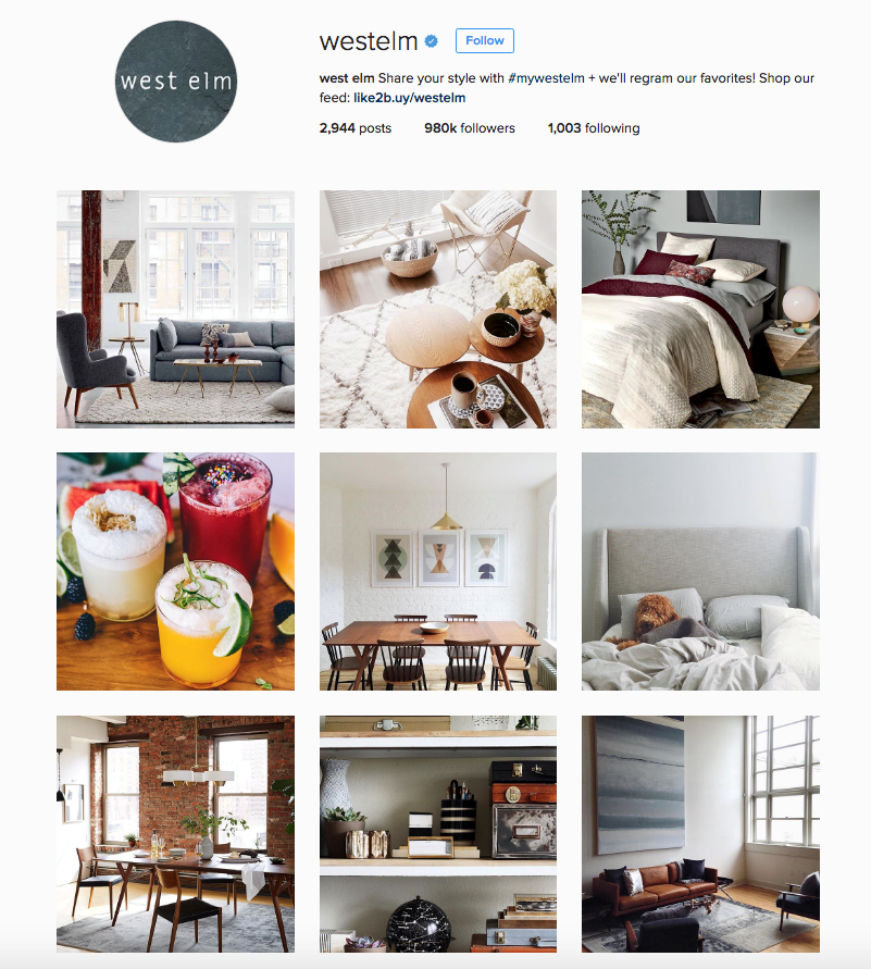
West Elm is a great example of a company that uses consistent and fitting imagery. They use high resolution images of their furniture and other home products in clean and modern settings, generally without any kind of filter. Their imagery always shows more than one product in a real-life setting, showing interior design that resonates with their core consumers.
Now that you understand the five key elements of visual branding, and have seen some great examples, you can use these elements to create a powerful and lasting brand for any company.


