 Courtesy of BCG
Great data insights don’t mean much if the folks controlling change don’t understand them or don’t have the time to pour over columns of data. Enter data visualization; the key to getting data insights to cause change that improves your market performance.
Big data/ big headache
Big data isn’t a new thing; it’s the size of data that’s new. In just the last 2 years, we’ve generated a zetabyte of data from scanners, mobile devices, web connected devices, television, and computers. To put that in perspective, every 2 days we create as much data as we did from the beginning of time until 2008!
And, every 2 years, we create 90% of all the data in existence.
By 2020, experts predict there will be 50X as much data as exists today.
That’s a lot of data.
But, data doesn’t mean much unless you can do something with the data — and here we’re most concerned about using big data to improve market performance.
Unfortunately, the character of big data is that it’s not only BIG, it comes at your extremely fast so, unless you have a tool that provides automated insights quickly, you’ve lost all advantage from having the data. You need to go from data collection, to analysis, to visualization, to strategy quickly or risk falling behind.
Here’s what Gary King, professor at Harvard University had to say about the big data revolution:
There is a big data revolution. But it is not the quantity of data that is revolutionary. The big data revolution is that now we can do something with the data. The revolution lies in improved statistical and computational methods, not in the exponential growth of storage or even computational capacity
Thus, when we talk about the big data revolution, we’re talking more about interpreting that data — putting it to practical use — than the amount of data generated, which is pretty uninteresting by comparison.
Data visualization
Data visualization is a little like herding cattle — it’s expensive and time-consuming, but, ultimately, necessary if you want to generate profits from your cows.
Of course, data visualization is only 1 means of corralling big data into something useful. Data analysis using statistical tools to generate descriptive, predictive, and prescriptive data analysis also synthesizes meaning from big data.
Even with data analysis, data visualization makes it easier to see not only descriptive data like height, age, and income, but predictive analytics reflecting the relationships among data, and prescriptive data showing the best alternative solutions.
Data visualization tools
Of course, the fall-back position in data visualization is static tools that produce boring line graphs, pie charts, and bar graphs. Even with bright colors, tools like Excel and SPSS produce pretty boring visualizations.
But, regardless of the tool, data visualization, at its best, should uncover new patterns of relationships not visible to the naked eye. Hence, the key to effective data visualization is the ability to capture patterns and relationships in clean, simple visuals that allow the signal to stand out from noise contained in the data.
Some tools for data visualization involve automated analysis of data as it comes in, while other tools involve manually creating infographics or other data visualizations that provide insights. Today, we’ll focus on automated tools used to analyze big data.
A subset of these data visualization tools are interactive, meaning individual users can customize the visualization to match their needs. For instance, a brand manager may wish data visualizations of a granular nature to observe nuances within the data, while the VP Marketing may wish data visualizations providing overviews across the various brands, with less granularity. Key to interactive data visualization is the ability of users to expand analysis; allowing the VP to deep dive into a piece of data to see more granularity.
If you’re interested in exploring options for data visualization, check out this post for a good list of available tools.
The problem of unstructured data
Unstructured data — words, images, video, and all other non-numeric data — represent 80% of the data available according to IBM and other digital data experts. But, the tools available for data visualization of unstructured data lag far behind those for visualizing quantitative data because the statistical tools necessary to derive meaning from unstructured data reflect a similar lag.
Tag clouds or word clouds are a rudimentary type of data visualization that transforms words into a graphic reflecting the frequency of word usage.
Association trees depict relationships among words used. For instance here’s an association tree from Information Management showing relationships between customer sentiment about a brand:
Cubism Horizongraphs is a tool for analyzing video and audio files. Using this tool to analyze call center interactions or sales presentations offers insights about customer problems, decision factors, and intentions.
Analysis provides data visualization insights from multi-dimensional data from a variety of sources, thus providing a 360 view of a customer or prospect.
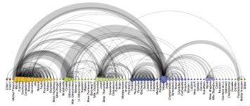
Network Graphs, like this one, show semantic relationships from large, contextual datasets. In this graph, you see the relationships between the characters in Les Miserables.
Data visualization for unstructured data: Software
New tools for using unstructured data to create data visualizations crop up all the time. Some of the big boys, SAP, IBM, SAS, and others have tools that adapt to unstructured data. In addition, here are some specific tools for handling unstructured data visualizations:
Datawatch provides a solution that creates visualizations from structured and unstructured data and, most importantly, integrate across data types and sources. Options for data visualization includes tables and grids, surface plots, stack graphs, and spread graphs. All data visualizations are interactive and they offer a dashboard for integrating across data. They offer a free trial and training, but don’t display pricing on their website.
Workday Big Data Analytics provides a solutions for data visualization for both structured and unstructured data.
MarkLogic provides a solution, Tableau, for visualizing structured and unstructured data that doesn’t require coding or IT support.
Zoomdata provides data visualization for semi- and unstructured data using tools like Hadoop and NoSQL to create interactive dashboards for visualizing historic or real-time data.
Image Courtesy of Information Management.