The following GeoCities tribute is best-viewed in Netscape Navigator on a candy coloured iMac, but if you happen to live in 2016 then I guess Chrome will do.
In our last Friday afternoon Team Talk, we noticed that we spend a lot of time talking about the latest and greatest trends in website design, but we have yet to pay tribute where it all started. How rude of us.
So here it is; we’re taking you on a trip down memory lane and reminding all of you homegrown HTML wizards of the 10 must-have elements of the flyest website you could build on Geocities just 3 short decades ago. Your next 5 minutes are packed with extreme sensory overload and reckless self-expression.
Step 1: Kick your kid sister off the phone. You need the phone line for your dial-up internet connection.
Step 2: Geocities…
#1: An eye-catching title, with bonus points if each letter is a different neon colour OR if it’s on fire.
Aggressive blinking and comet tails are good too.

#2: Flames aren’t just for titles. Flames are for all the things.
Have an animated flame border? You’re killin’ it. Bet your visitor count is doin’ well too.

SOURCE: 11points.com
#3: Speaking of that visitor counter…
It totally negates the need for Google Analytics AND as soon as someone gets to your site they can see how many times you made your mom look at it or refreshed your browser. Also make sure you pick one that clashes with the rest of the site’s design. Clash is key.
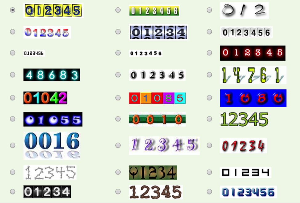
#4: A variety of different text formats in addition to the previous mentioned neon colours and flames.
Don’t forget alternating lowercase and uppercase and decorating each side with special symbols, and definitely choose either Times New Roman, Comic Sans MS, or Impact. Near-illegibility is the goal.
#5: Perpetual beta.
Not necessarily the kind we have in 2016 where you are constantly striving to be better, but the kind where you have a permanent “UNDER CONSTRUCTION” sign that smacks your visitors in the face like this pixelated beauty…

#6: Background music that can’t be turned off.
Because why would anyone want to be able to turn off a looped MIDI file of music from Star Wars, Mission Impossible, Titanic, or Mariah Carey anyway?
#7: Beveled edges and marquees
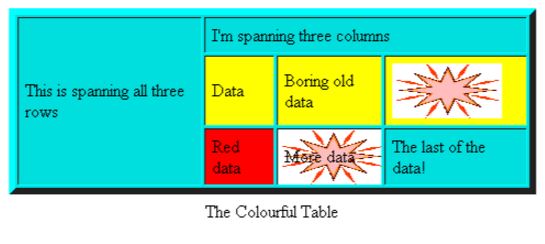
Mix in some of these. Make that shit 3D. No table about your favourite colours of cats is complete without beveled edges. Got some weird bouncy ball dividers? Make that shit scroll. This is the kind of stuff your classmates will write about in their diaries.
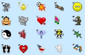
#8: A custom cursor. Also animated. Obviously.
Definitely have a soccer ball on fire or a blinking goat follow your visitors everywhere they go.
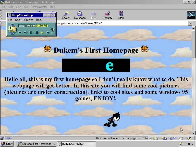
#9: Repeating pattern backgrounds.
If it hurts your eyes, you’re doing it right. Choose from a variety of grass, galaxies, roses, chainlinks, bricks, clouds, waves, metal, fake bunched up velvet curtains, straw, and bubbles. Also stripes with alternating and highly-contrasting colours.
#10: GIFs before GIFs were cool. And ALL of them.
When your visitors’ eyes can’t help but dart to 50 different spots on the page because the spaceships, seals, skeletons, palm trees, and dancing babies are all moving or flashing, success.
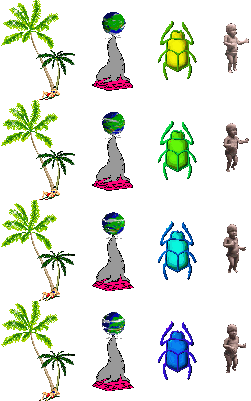
Thanks for the memories GeoCities!
P.S. If you’re interested in giving your own site a 90’s touch, head over to this brilliant GeoCities-izer.
