You spent time, money, and a lot of energy to build a valuable website. When you were making that investment, you expected certain things right?
- Traffic
- Leads
- Sales
The list goes on.
Here’s a hard truth. You can have all the traffic in the world but if those people don’t turn into leads and eventually customers, it’s all for nothing.
For that to happen, you need a high converting website.
The industry average conversion rate of 2% just won’t cut it anymore. This is 2019. Average is no longer acceptable.
This article looks at five crucial elements your website must have in order to get more people to take your desired action.
1. Social Proof (and how to use it)
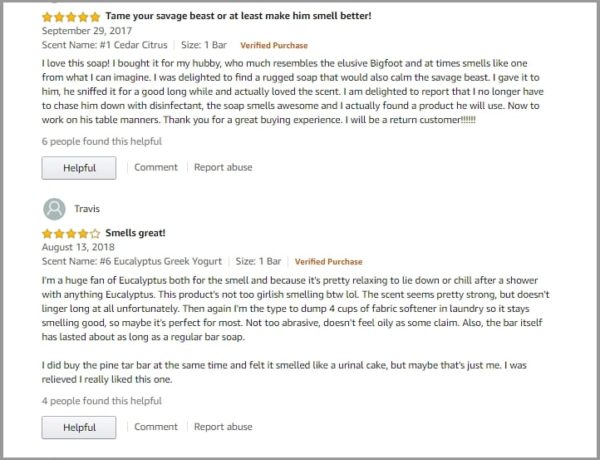
Social proof has been at work since time immemorial. In the not so distant past, we had to rely on our immediate network to find good products and services. It’s the most trusted form of advertising because your social circle has nothing to gain and everything to lose by recommending a bad product.
Recommendations have taken the form of stars and short blurbs (from sometimes faceless strangers).
Does that make them any less powerful?
Not at all.
Recommendations from people similar to us still hold a lot of weight. Social proof that showcases people similar to your target audience is more important than social proof from a big name.
Why?
It’s more relatable. This touches on psychographic segmentation because you’re looking at the why of their actions and showing the people that can influence it. The results the regular Joe gets are possible for the regular Jane browsing your website.
The results Rihanna gets – not so much.
When you’re soliciting feedback and testimonials from your customers, make sure you get it from people who’re representative of your customer base as a whole.
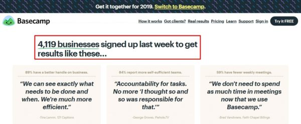
Another way to use social proof is to call out any numbers you have.
Did 331 people buy last week? Say so.
Are there 1942 people on your mailing list? Let us know.
2. Compelling copy
What makes your words compelling? It’s not what you say but how you say it. Good copywriting is speaking in a way that makes people want to take your desired action.
It doesn’t take an expert copywriter to write great pages, advertisements, and even blog posts that increase your conversion rate.
There are only two things you need:
- An understanding of who your market is
- The AIDA formula
You should have already done market research and understand your market.
The AIDA formula is a copywriting technique that stands for Attention, Interest, Desire, and Action.
These are the steps someone needs to go through before they take your desired action. It doesn’t matter if that’s to sign up for a lead magnet or buy a twenty thousand dollar car. The process is the same.
Breaking down AIDA
Attention is what gets them through the door. It’s what makes them stop for a moment and look closer. Online, that’s usually your headline.
After you’ve grabbed their attention, you’ll have to create interest in what you’re offering. This is where your understanding of your audience comes in. You can’t get them interested if you don’t know what they truly want can you?
A generic message won’t appeal to people in the way that’s necessary to generate a lot of sales. Instead of saying this product will help you lose weight so you’re healthier, speak to their real wants and needs.
Desire is the act of wanting something. Create desire, by painting the picture of the transformation you provide in vivid detail. Your product is the vehicle that’ll take them there.
Last on the list is action. It’s important to tell, in plain English, what the next steps are. The mistake people make here is assuming others will know what to do.
They won’t unless you tell them. If they need to click a button and enter their credit card details then let them know.
3. Clear Navigation
This is an overlooked way to score a quick win. It’s possible to do too much with navigation and it’s possible to do too little.
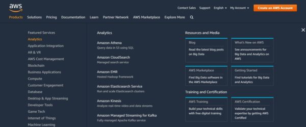
Here’s an example of doing too much with navigation.
In the image above, they’ve crammed tons of options into the menu. There are too many choices.
Here’s an example of doing too little.
In the image above, there are barely any menu options. In the footer, they’re also missing important links to standard information like terms of service.
This makes people think twice about whether you’re a reputable vendor.
There’s a quick fix. In the top navigation, keep the options to six or below. When you have other important pages, nest them below the main menu options.
Also, keep the nested menu at three items or below. If that absolutely won’t fit everything then apply secondary navigation on major pages of your website.
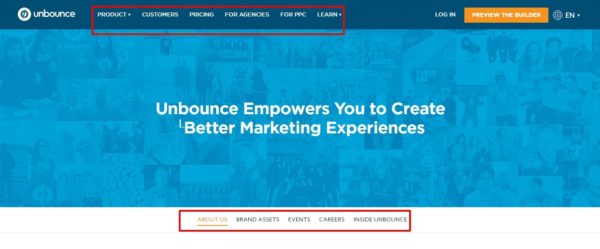
Here’s what that looks like in practice.
Notice how they have top main navigation. Instead of nesting more options under the menu navigation, they’re on the actual landing page.
4. Visuals that support your desired action
Some people say you should use real humans to increase conversions. Some people say you shouldn’t use people at all. Other people say you should use animations of people.
What’s more important is using visuals that add to what’s already on the page. The visuals shouldn’t stand alone and shouldn’t draw undue attention.
For example, if you’re selling a bike, an image of smiling people wouldn’t be useful. An image of smiling people riding bikes would be helpful.
That’s a simple example and it seems obvious but this is a big challenge for many websites.
5. Visible Action oriented calls to action
Every page on your website should have a call to action. It doesn’t need to be for the sale but you should be asking your visitors to take some kind of action.
Why?
Because micro commitments are powerful. They help you move a visitor closer to your final desired action – becoming a customer – without a big ask up front.
To employ micro commitments, use strong calls to action.
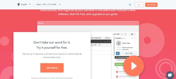
Hubspot has a visible call to action above the fold on their product page. They start with a compelling and informative headline and subheadline then simply state “get started” on the CTA button.
Your CTA doesn’t have to be a work of art. It just has to work. Test different types of action-oriented text and button colors.
Conclusion
A high converting website isn’t optional, it’s a must.
I’ve taken you through five simple strategies you can implement with just a few hours of work. Continue to test and tweak the basic implementation until you arrive at a conversion rate you’re happy with.
Start with easy wins like your navigation and calls to action then move into more complicated areas like writing great copy and social proof.
Dedicate at least two hours a week to optimizing your website conversion rate and you’ll be in good shape.
Photo by Brooke Cagle on Unsplash
