Do you like being confused?
No?
I thought so.
No one likes being confused. I sure don’t (even though it happens a lot). It means my brain is processing something incorrectly, and then I stop feeling smart. I like to think of myself as a genius, even if an IQ test would tell me otherwise. But you gotta have confidence, you know?
As a marketer, you and your brand are responsible for whatever feelings you put in your audience’s head. We’re more than willing to take credit when a video or blog post leaves them feeling inspired, happy, or intelligent. But how quick would we say “Yep, that was me!” when a visitor leaves a page confused…and without converting.
And really, really small things can influence how we make a customer feel. Things like color choice and image selection make a huge impact, and so does consistency.
Poor message match will make your audience member confused, which they’ll then blame you for.
So when a visitor clicks on a link leading to any page of your website, you should give them what they expected.
About Message Match
Message match is pretty much what it sounds like: it’s when your messages in two or more places are consistent. The words you use to talk about an offer on a landing page should be the same words you use when talking about or linking to it in advertisements, emails, other areas of your website, social media, etc.
For example, if you’re talking about a free ebook called “Your Small Business Guide to Local SEO,” that’s what you always need to say. If you abbreviate it somewhere and just say it’s a free ebook on SEO, someone who’s not interested in local SEO may click on it and then be frustrated when they realize they’ve taken time out of their busy day to research something that’s not of use to them. They may then associate you with wasted time or annoyance.
Even worse, you may use “On sale – 25% off!” in your ad, but then list the full price with no mention of a sale or discount on the landing page. That sale mentioned in your ad copy will probably be why someone clicks on your ad instead of someone else’s. If they don’t find that sale, they may associate you with deception and think of you as a liar.
Make Your Message Match Spark a Flame of Conversions
Excuse my cheesiness, but I really wanted to pretend that your marketing message could actually spark a flame for a second. It’s okay to be corny as long as I call myself out, right?
There are three ways to be sure your landing page meets the expectation of any visitors that come through an ad, email, or social post: use your ad copy in the headline, use the same and similar images in all places, and always title the offer the same way, whether it’s “Your Small Business Guide to Local SEO” or “25% off all handbags.”
1. Use Your Landing Page Headline in Other Copy
Assuming you have a well-optimized landing page, the headline will be one of the first things a visitor will notice. You want the first words they read to be words found on whatever website they found the page through.
Let’s say your landing page headline is “Save Hours with ABC Call Tracking Software.” When you’re promoting this landing page, you definitely want the words “save hours” and “call tracking software.” Your search ad could have your company name and the headline could be the ad description, for example.
Another reason your headline should match your promotional copy is because it means everything is accurately describing whatever you’re offering. As I said before, a headline is one of the first things people should notice. It’s also one of the most important parts of the page, along with the call-to-action. It should concisely describe the point of the landing page. Any promotion should do the same.
Even if you’re not purposely trying to make your headline and promo copy match, if they’re both written well, they will anyway.
2. Use Your Landing Page Image, and Its Theme, Everywhere
A lot of your promotion is going to need images. Email? Needs an image. Display ad? Needs an image. Most social ads? Yeah, they need an image, too. For consistent branding, you want all those images to be related.
The best thing to do is use the same image everywhere. But if you can’t or won’t do this, at least make the images similar. Use the same theme, the same colors, etc. If your landing page has a picture of a well-lit kitchen and there are cleaning products with pastel-colored labels on the counter, a close-up of the cleaning products might even be better if it’s going to be a small image on the side of a Facebook news feed.
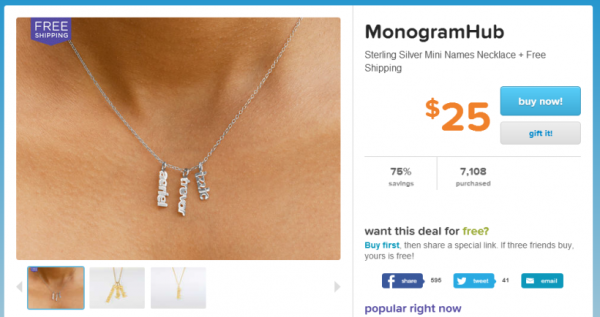
Take this Facebook ad, for example:
That’s a great closeup of the necklace they’re advertising. But when you’re taken to the landing page, you’re shown a different image as the main picture, and the great closeup is a thumbnail further down.
All the other elements of the Facebook ad really stand out pretty well, although the subheading with the name of the necklace and shipping deal could be more eye-catching. But you’re shown not only a different picture, but a different necklace altogether. Instead of a silver necklace with one pendant, you see a gold one with three. Message match fail.
3. Make Sure Offers Are the Same
This should go without saying, but if a PPC ad says “free shipping on all orders over $50,” the page the ad links to really, really, really needs to actually offer the customer free shipping once there’s $50 worth of stuff in their shopping cart. It should say something about it, too.
In this particular example, the customer will likely take ten minutes or more to shop your website, pick things out in the right size and color, and add the items to their shopping cart. If they take all that time, only to realize you want to charge them a ton for shipping despite your ad’s offer, they will be really annoyed. I speak from experience.
Strong Message Match in Action
(Big thanks to Unbounce for letting us use the images from this post)
Let’s take an example where everything matches up. First, the ad:
Now, the landing page:
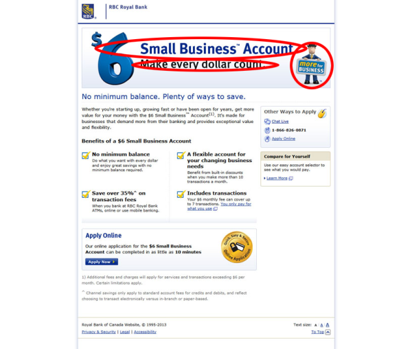
Unbounce has already circled the awesome parts of this example for you, but let’s go over them.
- The title of the ad is also the heading of the landing page. They are both the highest elements in the visual hierarchy.
- The first line of the ad copy is the subheading of the landing page. Once again, these match up in terms of visual hierarchy.
- The same image is used in both places. Although the ad features a cropped version, the visitor will still recognize it on the landing page.
- The offer is very clearly stated in both places. Create a small business account for $6.
Okay, Brittany. Wrap It Up.
Imagine you saw that last Facebook ad we just showed you. Before you clicked on it, what would you be expecting? I would expect more details about a bank account for small businesses that costs $6 to open.
When I’m taken to the landing page, that’s what I get. I find out exactly how they’ll make my every dollar count, and how it can save my business money. I get the information I clicked through to get.
I’m not confused. My expectations were met. I’m happy. I’m about to start saving money.
That’s strong message match, and you want your marketing to have it.


