 “So which won: A or B?”
No matter how long you’ve been running a testing program—or how long your executive has overseen a testing program—it’s easy to be thrown off by this question.
Your executive and the leadership team they work with want a clear answer (usually a straightforward one). So, resist the temptation to give the technically correct response, which often sounds like, “Is there really a winner? Website testing combines art and science, with details in every test campaign and a complex mix of KPIs. Even a result that isn’t statistically significant can still teach us something.”
The executive answer should sound more like this: “B.”
If you’re deep in the test data day-to-day, you may be finding it hard to collapse everything you know about each test into a simple “Here’s the winner!” reply. But your leadership team will value your ability to do so.
Don’t worry: All it takes is one PowerPoint slide. That’s the language of executives, and it allows you to translate the test data from complex Excel spreadsheets into a concise visual communication for an Executive Test Report. If you do this well, then any executive at a glance will be able to understand the test and determine whether “A” or “B” won.
Here’s how to do it:
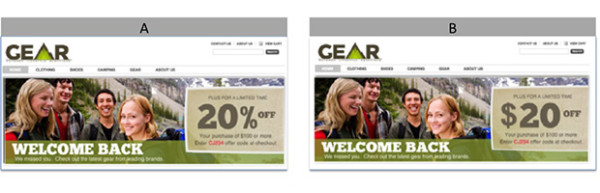
1. Capture full screenshots of “A” and “B.”
One picture is worth 1,000 Excel cells. Make sure you get images of the complete context of both the “A” control and the “B” experiment versions for every test, whether on the home page, product catalog or promotional email. This lets your audience quickly see the placement and nature of the test.
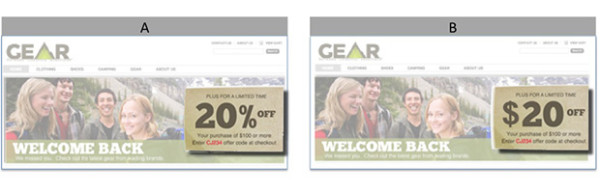
2. Highlight what’s being tested.
The full screenshots are there for context. Fade them out in order to highlight the specific change between “A” and “B.” Use the transparency and shadow settings in PowerPoint to contrast the background image from the focus of the test. This helps make the difference pop.
3. Align the hypothesis to the metrics.
The saying “You can’t manage what you don’t measure” comes into play here. If your hypothesis can’t be measured in your testing tool or third-party analytics, you can’t test it. Aligning to the metrics will also help you—and your audience—easily determine the winner.

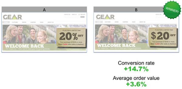
4. Show only the metrics that matter.
Yes, you may have tracked 10 KPIs, but according to the hypothesis, only one or two metrics matter. And for your executive audience, those are the metrics that matter. If you work for a retailer, for example, engagement metrics may be important to you, but, more than likely, the executive will want to know if average order value or conversion rate went up.
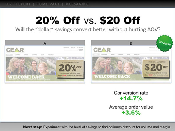
5. Put these pieces on one, and only one, slide.
Laura Arand at Cornerstone Brands was the first person to give me the “one test, one slide” advice. And it’s the most important part of this process. Limiting yourself to one slide ensures you will bubble up only the images and data that are most important. It also makes your presentation easy to share and understand. The heading gives this campaign context while viewed through a larger testing strategy. The “Next Step” footer indicates learnings and pending iterations.
Once you have this slide format set for one test, keep repeating it to make a full deck of your most recent test results, which you can distribute to leadership. Keep the tests with “null” results out; only focus on those A/B tests that showed a significant difference in commerce metrics.
Then, when that executive drops the “Which won?” question again, you’ll be able to show the slide. And you’ll be guaranteed to deliver the right answer.
Test report image courtesy of Shutterstock.