I spend a good deal of time looking at websites that have been developed using a responsive web design (RWD). Often, many of the websites using RWD are agency sites or personal blogs, and sometimes it seems like a RWD design might only be practical for the more creative type of website. However, this is simply not true. Every type of website can benefit from using a responsive web design to allow web visitors to access the same site and content no matter what kind of device they are using. As a snapshot of an industry segment doing as much, here are 10 examples of ecommerce B2C businesses using responsive web design.
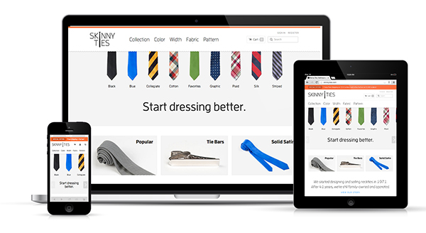
This is one of my favorite responsive retail sites because it provides a wonderful user experience whether I am on my desktop or my iPhone. Looking at this site, it is easy to tell that the designers took a “mobile first” approach to the design. The elements are all very touch friendly, and the site has a consistent look and feel no matter how you interact with it.
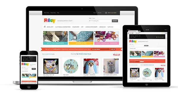
This is a site that focuses on selling crafting supplies and homemade goods. I definitely think it is a good idea for brands who sell this type of product to consider a responsive web design because so many of their customers are accessing social crafting sites like Pinterest from mobile devices. A responsive web design like this makes it easy to shepherd prospects down the sales funnel.
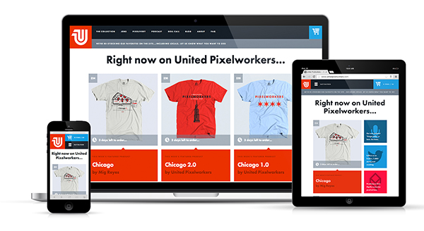
United Pixel Workers is a company that sells T-shirts and accessories designed by the web design community. Given its customer base is so tech savvy, it’s not surprising to find the company’s website is as well. The site uses a simple grid that scales very well to fit on smaller screens. I especially like the way the cart and menu buttons adjust at every screen size so they remain easy to find and click on.
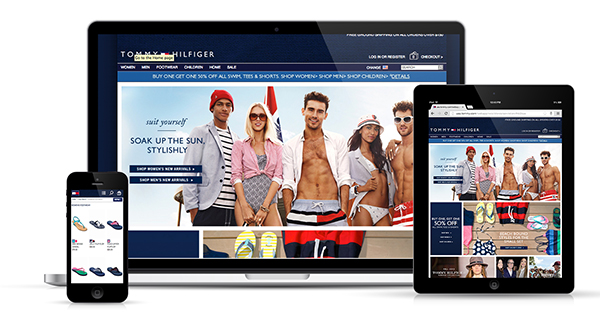
I was actually a bit surprised to find that the Tommy Hilfiger site was responsive because it seems like a lot of bigger brands seem wary of making this change. For many brands with larger websites and huge product selections, the idea of making web content responsive can be a daunting task. However, I think it is a change that must be made, and Tommy Hilfiger has done a pretty good job of making it work. This RWD website isn’t perfect, but it is easier to shop on than most other retail mobile sites I have visited.
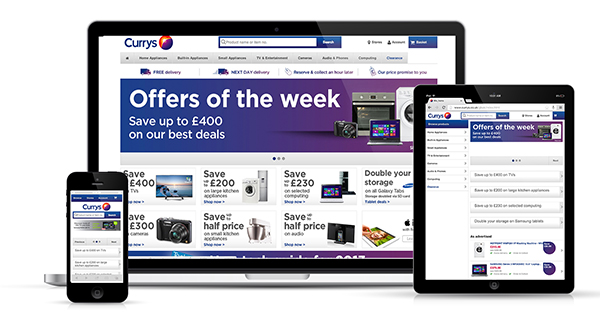
I will admit that this website for the UK electronics retailer Curry’s is anything but beautiful. I have chosen to include it in this list because I think it is important to see how an online retailor with a HUGE stock of products can make a responsive web design work effectively. What it lacks in visual appeal it makes up for in usability. Everything on this site is organized and has a purpose. I also like the large navigation buttons that are good for touch and in your face, and the search function which makes searching for particular products a breeze. This site certainly fulfills it’s duty to make purchases simple for customers on any device.
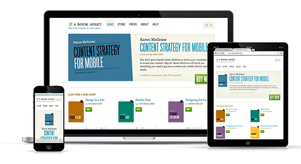
This retail site is the go-to place for educational resources about web design. It is no surprise that the company responsible for publishing one of the first books about responsive web design is utilizing the technology. The A Book Apart storefront layout looks good on every device size and never appears cluttered or crowded.
Just another specialty retailor that seems to be well ahead of the bigger brands. Again, this isn’t the most beautiful responsive website, but it is still successful. The navigation system here is easy to follow, and shopping on smaller devices is a simple, painless process.
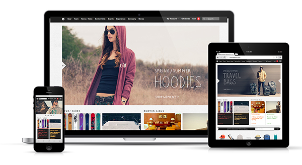
I believe snowboard retailer Burton definitely knows its customers are shopping this website from their phones and tablets. The company has made a smart choice in choosing to adopt a responsive web design that gives users the same experience no matter how they choose to shop. I do wish the navigation was a bit easier to click on the mobile screen size, but I like the way they have used images and a simple grid to make the design conform to any screen size.
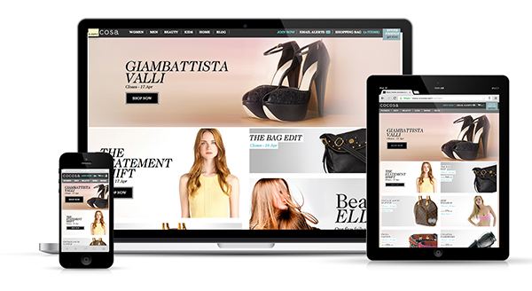
Cocosa is a members-only retail shopping site. You know, one of those websites where you get daily email updates about new and upcoming sales? As someone who is a member of a bunch of them, I can tell you first hand how annoying it is to click on a link in an email and then be sent to a mobile version of the website asking me to download the app. It’s like the catch-22 of mobile shopping. Cocosa solves all that by simply having a responsive website. Click an email link and be sent directly to the RWD website to enjoy the mobile shopping process.
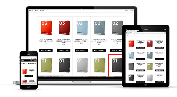
Visual Supply Co. has a very simple, straightforward storefront selling photo-editing software. I like that this store has such clean lines, and I appreciate that everything is easy to click on when I access it from my mobile device. Big buttons are essential for touch, especially that big “Buy Now” or “Add to Cart” button!
A responsive web design is the best method to ensure that your website is useable on nearly every device. This is especially important for ecommerce websites, because you never know how and when your customer will try and make a purchase. From fashion to food to educational resources, a responsive web design is a great way for any online retailer to reach customers anywhere, anytime.
Read more:
Great examples of some very cool e-commerce sites, Jacey. Nowadays, every business needs to make sure that their website is mobile-friendly, and responsive design is a great way to handle that. The businesses that utilize it will keep their visitors happy and engaged. Those that do not will find that their site will quickly become irrelevant, if it isn’t already.
You are absolutely correct in saying that those that don’t go mobile friendly risk losing customers! I would even venture to say that RWD websites can even be more effective than simply a mobile site because your users will always have the same experience no matter what kind of device they are using.
Great post! :)
Thanks for the feedback Josh! Glad you enjoyed it!
I agree with your thoughts 100%. As more and more people use mobile devices it only makes sense to adapt and I think RWD may be the easiest way. Just the other day I found a great example of a ecommerce site that was viewable on my phone and I’ve said told everyone about it. It was one of those things where I work all day on a computer and when I go home, I really just want to relax and not turn my computer on. Know what I mean? haha. Anyways, I received an email that one of my favorite stores was having a sale, so I clicked on the link from my phone’s email and low and behold it worked. I was able to buy a few items without even turning on my computer, it was extremely convenient. That being said, great read and glad to see other stores are picking up on RWD, this is one trend that I hope doesn’t go away.
Lauren, I totally know what you mean! I feel the same way when I get home from work! I absolutely hate it when I click on emails that send me to weird mobile versions of the site so I am happy to hear that you actually found one that uses RWD to make it work! yay!
I work with EliteRestaurantEquipment.com we do not have a responsive site although we are working on it. For items like refrigerators do you think people are going to purchase them online? Also does anyone have any solutions for responsive for Magento?
Hi Jacey,
Nice examples for sure! I have an article coming out later this week and another next week that cover in detail the pitfalls of not being at least responsive but adaptive in the best case. Here is a link to an Infographic we put up a few days ago that really details why you HAVE TO be on this edge if you’re a business! http://knoxvillebusinesslaboratory.com/is-your-companys-website-mobile-app-and-tablet-ready/
Thanks again for the nice examples!
Great infographic! I might just have to Pin that one!
Great post! And I’d like to add http://www.indochino.com
I like it! It’s really wonderful how the images are scaled down as the website responds. The overall effect is a very luxurious looking site.
Thank you for sharing Jacey! It’s firms like yours that will help clean up the web and make the user experience a much easier! Forbes.com featured an article and our company (Trighton Interactive) last month. It’s great to see responsive Design getting traction finally. Thanks again!
Thanks for the feedback Jonathan! You keep doing what you’re doing too and soon we’ll make sure that RWD takes over the world!
Excellent post!
I have to agree, as technology advances and networks become faster mobile shooing will play a major role for many e-commerce businesses. Site have to become responsive to different platforms in order to maximise on sales and user experience.
Great examples…I’ve been urging my clients for years to move to a RWD platform…one who did:
http:lagunapottery.com
Hi Jacey, do any infor on their platforms.. ATG, Hybris ..?
I am intrested in finding out more about what your company can do for me. Not currently happy with current web provider.
Derrick…I build responsive websites on the magento platform.
Excellent article showcasing some of the best responsive commerce websites. I have been rebuilding my own commerce site to be responsive and would really value your opinion and feedback.
http://www.racyangel.co.uk
Responsive design is going to really blow up in the e-commerce sector, since the mobile purchasing trend is accelerating. I like the examples, but I’ve seen a bunch of them before. Here’s a great responsive e-commerce site that’s probably not on any lists yet.
The Webstaurant Store – http://www.webstaurantstore.com/
I think it’s still in Beta, but it’s pretty cool. Good to see e-commerce examples that aren’t online clothing stores. No offense to them, but variety is good too.
Do you know the ecommerce platform they are using?
@Seth – Are you aware what ecommerce platform WebstaurantStore.com is using?
RWD needs to be an enabler not a disabler. People too often jump on a bandwagon. Clearly trying to design an entire multi channel website with RWD in mind will have constraints that affect time to delivery and project costs. As with most things a pragmatic approach should be considered. Be responsive where you can but give yourself some wiggle room such as allowing the option to override presentation tier templates at a channel level will probably offer the most flexibility. Probably not as cool though!
One concern I continue to have with the Internet and this is the forgetful blogger. One core component missing in this otherwise good article – you forgot about your audience, you forgot that some of us might not know exactly what RWD is! I am one of them that got half way through before being able to work out what RWD meant. With so many new and changing abbreviations around these days, a simple short paragraph defining this weeks jargon that is being used would help those of us whom have no clue what you are talking about.
Otherwise, a good and helpful article that taught me a few things. Thank you.
Sorry about that Kul! I guess I am guilty of being a bit forgetful. My apologies. RWD as you might have figured out, stands for Responsive Web Design!
There are some smaller stores that are diving into the RWD world as well. Quality responsive web design isn’t only reserved for the biggest operations with the deepest pockets. One awesome example is Ephedra Outlet (http://ephedraoutlet.com) who have done a great job at unifying their brand across devices. Disclaimer: I helped develop the site, but it was their original vision to go RWD instead of m-dot.
Thanks again for the great article – it’s good to see what’s out there in terms of progress in e-commerce.
excellent collection of sites. I would have loved to see Indochino.com in that list. We are working on a responsive theme for our store owners. Hope to have one of our themes in that list too!
Thanks for putting this article together, Jacey. However, I must say that not all ecommerce sites need to be compatible with every computing device. This is largely the result of the business’ target market. I sell chainsaws and landscape equipment, by which my target market is an older and less tech savvy demographic which does not use mobile devices for its shopping and/or purchasing. Food for thought.
Hey Levi, you make a good point. I agree that right now, a responsive website is not necessarily the most economical option for every business especially if you have done research and determined that your customers are not making purchases on mobile. But at the same time, I think it’s important to always be forward thinking about what the future may have in store. Though this may not be something useful for your client now, it could very well be in the next few years!
Since the only viable alternative is a separate mobile site (which carried a huge maintenance overhead especially in terms of e-commerce) I’d definitely say responsive is the future. Much better than the older type liquid layouts.
Jacey, I agree with you. I think that responsive website are a must. In 5 years if your website is not responsive it will effect sales! The other day I was looking for an Ice Machine for my kitchen. I went to a bunch of websites and came accross this great, simple, easy to use website.
Check it out…
http://www.icemachinesplus.com/
Ben
I concur with this article. RWD definitely seems to be the future of web design.
We just launched our website with the RWO design and we love it.
Consolidated Foodservice:
http://www.consolidatedfoodservice.com/
If there is anyone that has any suggestions, we would love to hear them.
One of our fav aspects about RWD is the mobile friendliness
85-90% of sites need a responsive web design. Look at your site analytics and see how many visitors are coming in from a mobile OS. It is usually very significant (25-45%). Sales on phones and tablets is off the charts. Mobile is being adopted faster than any platform we have ever seen. Its not the future, it’s already here.
Great examples! We wrote about this post in eCommerce Trends report
http://divanteltd.com/blog/e-commerce-trends-2013-2014/
Awesome! I enjoyed your slideshare!
Our site is built on Magento too. Check out http://www.slideteam.net . It is integrated with PayPal and 2Checkout to build a SAAS model. It a unlimited download subscription based site. SlideTeam is the world’s largest supplier of innovative, creative and highly effective Powerpoint content. It was founded by a group of entrepreneurs who believed that there is a better, less time consuming way to develop complex PowerPoint presentations.
Agreed responsive web design is the best way to ensure your app is running well on each device.Nice article.