Traffic is up, but lead conversion numbers aren’t improving. The end of your reporting period is coming up fast, and you need a quick fix for jump-starting lead conversions. What’s a marketer to do?
Here are some of our favorite quick and easy ways to improve lead conversions on your website:
Choose offers that answer visitors’ next logical questions
Effective lead conversion opportunities provide site visitors a logical next step to their task at hand. So, it goes without saying that ensuring close alignment between page content and the CTA that appears alongside it is a great way to increase conversion rates.
When thinking about what offers to place alongside content, put yourselves in your visitors’ (and personas’) shoes: what would they want to learn about next? What questions are they left with? What is the next logical step they’ll need to know about on the way to purchasing your product or service? Choose content offers that align with the answers to these questions.
Generally speaking, the conversion opportunities you provide visitors should accomplish at least one of the following:
- Provide an answer to a question posed by page content
- Take a deeper dive into the topic discussed in page content
- Give a broader view of how page content fits into the big picture
- Provide specific solutions or solution strategies to the problem or issue discussed in page content
Do all your offers align with the content on the page where they appear? If not, consider swapping out offers or modifying CTA text to better match page topic.
Place best (and well-aligned offers) in high traffic locations
No, this doesn’t mean at the top of your homepage. Instead, take a look at which of your past blog posts have generated the most traffic and what their conversion rates are. Any post with a conversion rate below 2-3% deserves a new CTA – one specifically aligned to the topic of the blog post. While you certainly don’t have to create a new offer for each of these posts, it’s worth re-doing the copy on the CTAs for some of your more successful offers to better align with the topic of the post you’re optimizing.
Got a post about SEO trends for 2016 and an offer about on-page SEO best practices? Instead of using your generic “Get the On-Page SEO Best Practice Guide,” consider creating CTA copy along the lines of “On-Page SEO In 2016: The Best Practices.” This alternate wording creates a more direct link between the blog post topic and your offer, and can help to increase lead conversions on both the offer and the post. (Just make sure you update your landing page copy to align with your new CTA positioning, as well.)
Match CTA, Landing Page, and Form Messaging
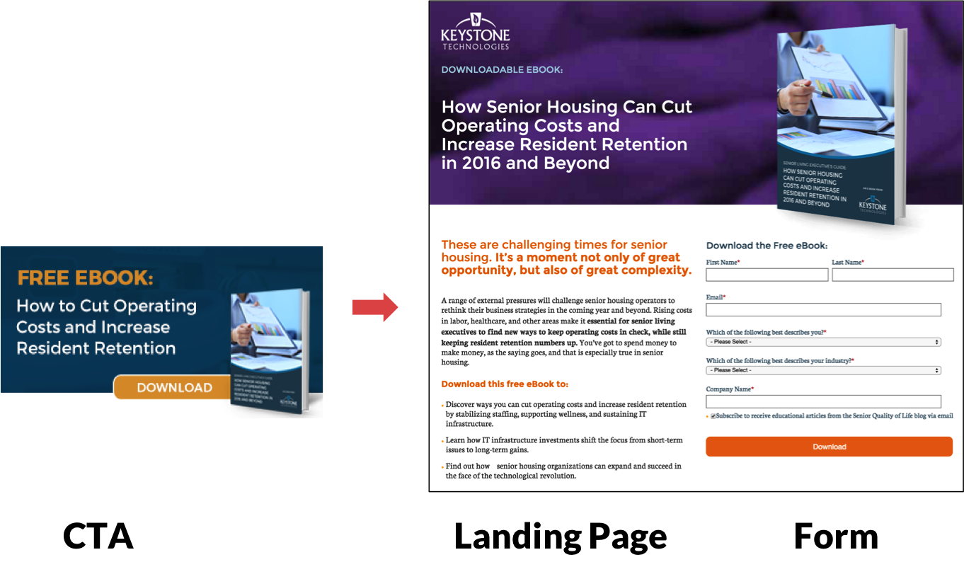
Don’t bait-and-switch your visitors: make sure the copy on your landing pages is as closely aligned as possible with the actual title of the offer you’re hoping they’ll download on the form. This helps to build trust, simplifies the user experience, and makes it more likely visitors will feel comfortable providing their personal information on the form in exchange for your offer.
While it’s important to keep messaging as aligned as possible, don’t do this at the cost of a well-designed CTA or attention-grabbing text. If your offer title is very long, tweak its positioning on your CTA so as to still garner attention without sacrificing a clear and effective design.
Here’s an example of a well-aligned conversion path that uses a variation on the offer name:
A/B test landing page headlines
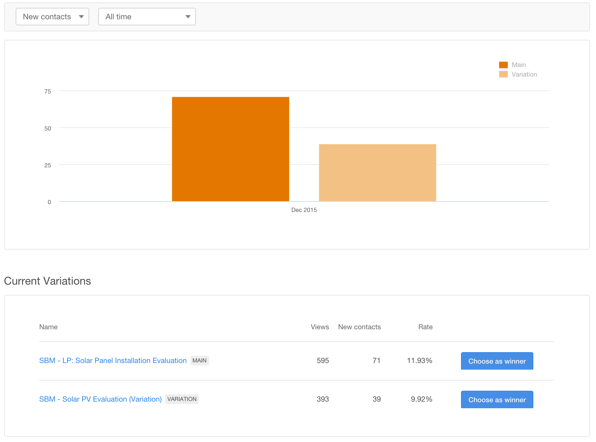
Not sure how to best position your offer? Another quick and easy way to improve lead conversions is by A/B testing landing page headlines. Create two versions of your offer landing page that both use different headings and page titles, then see which performs best (or, use a built-in landing page testing tool like HubSpot’s).
Once a winner has been determined, deactivate the version with the lower conversion rate. If there isn’t a clear winner or your overall conversion rates are still low, try running your test again with new copy. Test things like positioning the offer for a particular persona, showing the offer title versus benefits of downloading it (i.e. “Executive Guide: Increase Occupancy Rates in 2016” vs. “How to Increase Your Occupancy Rates in 2016”), and so on.
A/B test CTA copy
A/B testing isn’t limited to landing page headlines. To quickly and easily improve lead conversion rates, try testing alternatives to your CTA copy, too. Tweak everything from positioning of an offer (i.e. “free guide” vs. “free eBook” vs. “complementary guide” vs. “complementary eBook”) to the title of the offer itself, to the button design – just be sure that the CTA ultimately still aligns with the offer.
One of the telltale signs of a poorly aligned CTA and landing page is a high click-through rates coupled with a low form submission rate. If you’re seeing this in your numbers, evaluate both the CTA and landing page copy to see where improvements can be made.
Reassess Form Length
Another reason you may see high call-to-action click-through rates coupled with low form submission rates on your landing pages is excessive form length. Your CTAs may be attention-grabbing and your landing page copy compelling, but if your forms are disproportionately long relative to visitors’ perceived value of the offer, or if you’re asking for information they deem too “valuable” (such as phone number or mailing address), visitors may balk at filling out your form and taking the final step to become a contact.
While there isn’t a hard-and-fast rule for how long is too long for a form, length should be correlated with the “value” of the offer. This means that your blog or newsletter subscription landing page should have substantially fewer form fields (say, no more than three to four) than a free product trial page, which would likely have closer to seven to eight (or more) fields. Also keep in mind that not all form questions are created equal: visitors hold some, like mobile phone number or home address, more sacred than others and will be less likely to fill out forms that require this type of information.
Considering shortening your forms? Here are some tips:
- Make sure each question is truly valuable to collect. Just because you think you might need visitors’ company names down the road doesn’t mean you need to ask for it on every form. If you’re unsure what information is most important, ask your sales reps what’s most valuable for them.
- If a question is worth including on a form, then it should be marked as a “required” field. This goes both ways: if something isn’t worth making required, then it’s probably not worth including on the form.
- Use progressive profiling to ensure you’re not asking the same question over and over – and are continually collecting increasingly detailed information about contacts.
- Auto-fill form fields with information users have already submitted. This cuts down on the total number of fields returning contact will have to fill out on the next form they submit.
- Avoid “multiple select” checkboxes or radio buttons whenever possible as they make forms visually appear longer than they actually are.
Use Mobile Forms
Notice most of your landing page form submissions are from desktop browsers? Your visitors on mobile phones may be bouncing because your landing pages aren’t optimized for them.
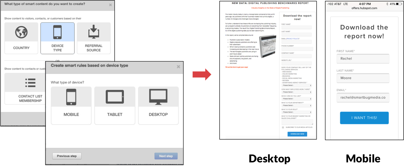
While you can use media queries or contextual marketing to create mobile versions of the entire page, a quick and easy way to accommodate users on their smartphones or tablets is to create mobile-friendly versions of your forms. Try to use no more than three to four form fields, and stay away from things like checkboxes or radio buttons, which can be hard to select on small screens.
If you’re using HubSpot, mobile-friendly forms (and landing pages) are easy to set up with Smart Content:
You can also customize content shown to visitors on tablet-based browsers, as well.
What are some of your favorite, fast, and effective ways to jump-start lead conversions? Let us know in the comments section below.


