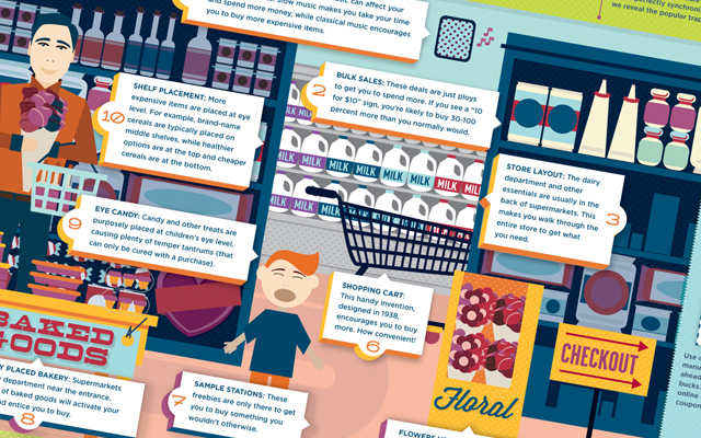
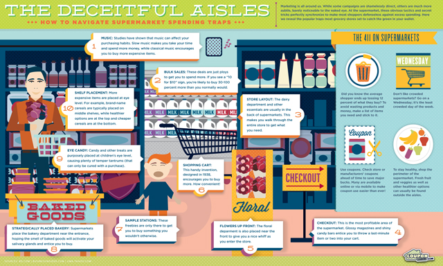
Have you ever thought about the supermarket? I mean, really thought about why it’s arranged the way it is. Why certain items are located where they are, the marketing strategies (like 10 for $10), coupons, music choices, and sample stations? Supermarkets use some clear tricks to get us to shop the way they want us to so we spend more money. There are also hidden design tactics at play that make it easy for us to give in to unnecessary spending.
Some people may think the store is set up backwards. “Why don’t they put main dish items next to side dishes?” Which isn’t a bad way to look at the design layout of a supermarket. In truth, supermarkets are set up to be all kinds of ass-backwards. Left, right, sideways, upside down while looking into a mirror — types of backwards. If everything you needed was setup in succession at the front of the supermarket, why would you have any reason to walk through the entire place to pick up other items you need or don’t need?
Someone out there has the distinct job of making sure you have to traverse the entire layout of a supermarket in order to find the things you really need, in hopes that along the way, you pickup a ton of stuff you don’t. The main culprit of this thinking is having shiny magazines of celebrities, candy bars, and drinks available at the checkout stand — which is also one of the biggest money makers for a supermarket. So the next time your in the supermarket, remember some of these tricks outlined in this infographic and you’ll start to see a very different picture being painted for yourself.
Click here for a full-sized view.
via: Coupon Cabin

