It’s no secret that we eat, sleep, and breathe digital marketing. But we’re also the first ones to say that a great sell sheet is an important part of your B2B toolkit.
Done right, this one-pager gets you noticed and gets them interested. The goal is to provide enough information to lead to a second conversation, but not so much detail that it becomes overwhelming or confusing. The last step is packaging the information in a stand-out, digestible design.
Let’s break down the elements of a killer sell sheet design using a recent example.
The product is the hero.
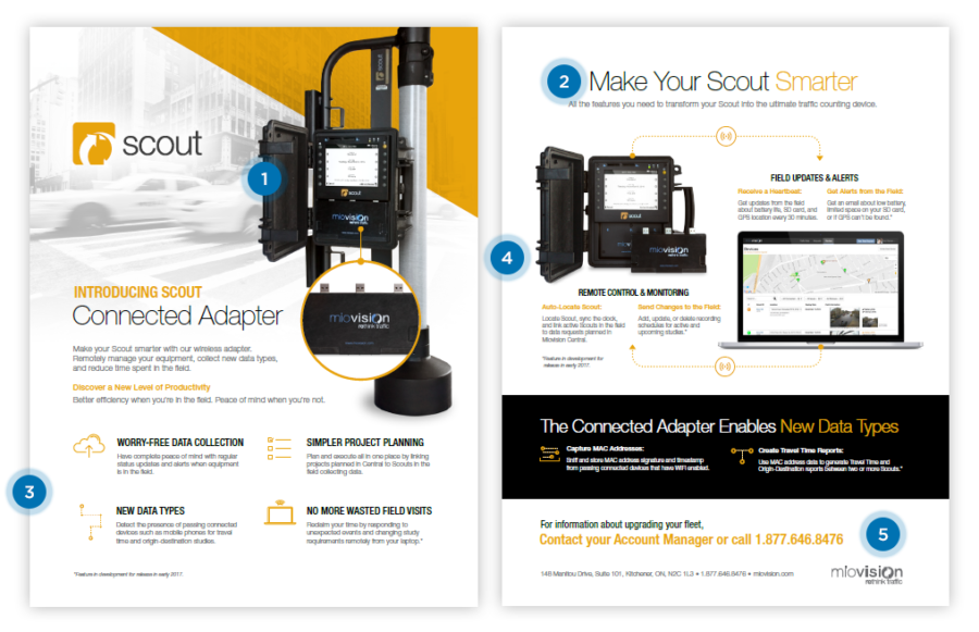
Invest in a high-quality photo of it. Try a unique angle to add visual interest. In this example, the designer helped the product stand out by layering it over a faded intersection. The intersection adds depth and provides context for the setting the product is used in (1).
Focus on the key selling feature.
Often there is too much focus on the company logo or product name. But what your prospect actually cares about is the derived benefit. What problem are you solving for them? Did you just release the add-on feature they have been waiting for? The key selling feature should be a visual priority (2).
Organize information based on themes.
“Be succinct” is sell sheet 101. People tend to skim instead of read. Breaking up large blocks of text with headings and keeping content short and sweet is only half the battle. Instead of a lengthy bullet list of features and benefits, parcel it out into themes.
Let benefits shine in their own section with intuitive icons and bold statements (3). Highlight features in a separate area using a well-labelled visual for instant understanding (4).
Consider balance in your call-to-action.
While you don’t want to splash pushy CTAs all over your one-pager, you do want to be clear about how to get in touch. Round out the sell sheet with a benefit-focused CTA that provides a direct and easy way to follow up (5).
