 As well as the right information expressed in the right language, it needs to be presented in such a way that the message is clear and the key points jump out. Presentation matters!
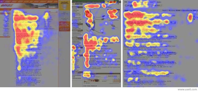
Jakob Nielson’s web usability study from 1997 showed that 79 per cent of web users scan rather than read. In addition, eyetracking visualizations show that users often read Web pages in an F-shaped pattern: two horizontal stripes followed by a vertical stripe.

Heatmaps from user eyetracking studies of three websites. The areas where users looked the most are colored red; the yellow areas indicate fewer views, followed by the least-viewed blue areas. Gray areas didn’t attract any fixations.
The above heatmaps show how users read three different types of Web pages:
- An article in the “about us” section of a corporate website (far left)
- A product page on an e-commerce site (center)
- A search engine results page (SERP; far right)
Source: Nielsen Norman Group
Think ‘F’ for fast
Don’t expect your readers to read every single word you’ve written. Exhaustive ready is rare, especially when your prospective customers are trying to quickly compile a shortlist of companies to approach. Most of your readers will read the first paragraph, but they are less likely to read the second paragraph and it’s important to realise that people will read the first two words of a line, bullet-point or sub-heading that the third or fourth word.
The implications for web and email design are clear, and these two studies highlight the importance of thinking about how you present your written material. It’s also important to realise that you can’t just repurpose printed content on the web, without adapting it for how people read and scan copy.
Using formatting for powerful presentation
You need to use formatting to make sure your copy catches the eye of your reader, so that they will engage with your message and read the important parts. Here are 10 easy formatting rules so that you get those scanners to decide to read more:
- Break your copy up with sub-headings that capture your reader’s attention and focus on the benefits.
- Put your conclusion first when writing a paragraph and follow with the supporting information.
- Use bullet points or numbered lists to make it easy for your reader to pick up on multiple points and provide a visual break.
- Keep your sentences and paragraphs short, around 3-4 sentences per paragraph works well.
- Express only one idea per paragraph, stay focused and don’t ramble — less is more.
- Add images where appropriate and caption each one as, along with headlines, captions are the most read item on a page.
- Paragraphs don’t have to be all the same length; by using ‘choppy paragraphs’, i.e. a two-line paragraph followed by a five line one then a three line one, you can create interest.
- Use bold text to pick up on key points within a paragraph.
- Don’t highlight too much text or it will lose its impact.
- Make it appealing to look at and make sure there’s enough ‘white space’, remember the return key is your friend.
As a final check…
Scan your copy, reading just the words you’ve highlighted, such as the subheadings, bullet points and bold text. Does it make sense and will your reader understand what the message is? If the answer is yes, then you’ve written copy that is more likely to be read.
Do you scan read web pages and emails? What attracts your attention on a page? Let me know in the comments below.
