You’ve spent an entire week crafting the perfect blog post with words & phrases beyond compare. You finally hit the publish button and eagerly await for people to read it. And you wait. One week passes, then two, then three. Before you know it, it’s been a month and nobody has read your article, not to mention liked or shared it. This is enough to send a writer spiralling in despair.
You start to ask yourself: “Was my article not good enough?”, “Should I spend even more time on my next piece?” The answer to both of these questions is probably no. In most situations, it’s not your fault. The majority of users will spend less than 10 seconds on a typical web-page. Only a select few will take the time to go through your entire article.
But that doesn’t mean that you can’t entice their appetite for reading with a few simple tricks. I’m sure you’ve seen mediocre articles online that get hundreds, if not thousands, of shares. But why? Recent studies have shown that writing less, and formatting the text so that it becomes easier to read will increase engagement levels and make visitors spend more time on a page.
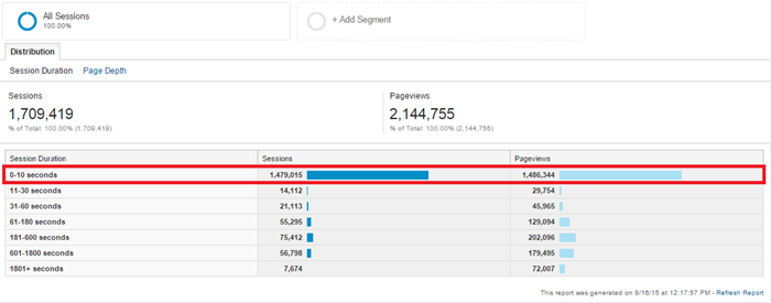
Example of website with extremely low engagement levels. Approximately 80% of visitors leave after the first 10 seconds.
Why is Text Formatting Important?
According to a 2014 study conducted by Tony Haile of Cartbeat, we have only 15 seconds to capture the reader’s interest. The attention span of internet users has probably become even more fickle lately, especially due to the proliferation of mobile devices and apps. In his study, Tony also added that internet users aren’t reading online content the way we think they are. He believes that webmasters & internet marketers should stop using article views as primary metrics, and start focusing on page engagement and reading time.
Note: Tony Haile defined ‘engagement’ as the amount of time that a user spends actively engaging with his browser (scrolling, typing, navigating etc.).
For those who want to learn how to make a blog or how to run a content-driven business, I believe that the biggest takeaways of the study are the fact that users tend to engage with newsworthy articles better than with evergreen content and that proper article formatting has the power to maintain a reader’s attention for longer periods of time. Luckily, the latter is more or less under your control, and by understanding and applying the best practices used by successful bloggers, it is possible to double the average time that a user spends on your page.
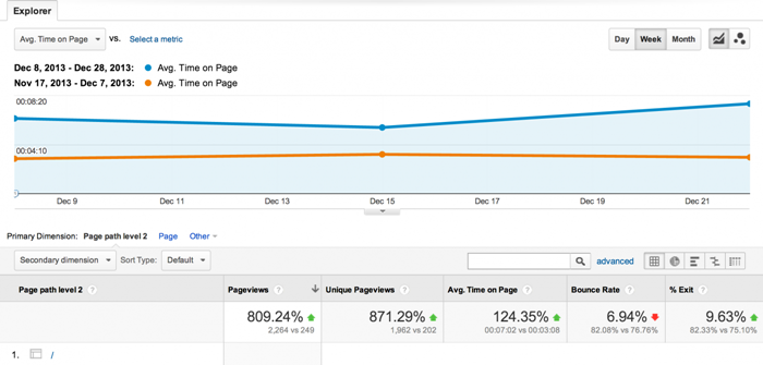
Case Study: Gael Breton of AuthorityHacker managed to grow the traffic on one of his pages by 9275% by re-formatting it.
1. Use Compelling Sub-headings Wisely
Since this is one of the basic rules of article formatting, you would expect bloggers to know how and when to use sub-headings. Surprisingly, most articles I find online have no logical breakup. They’re just an endless stream of dull text. Besides the fact that sub-headings improve the visual aspect of an article and highlight important elements of a page, they also add SEO Value. Search engines like Google give priority to sub-headings.
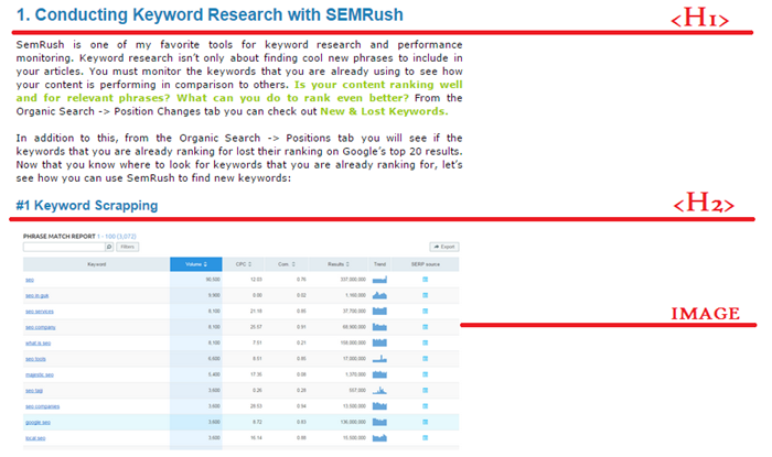
You should always use the <H1> tag only one time in an article. That’s because it’s the most important element of a page, after the title. Adding multiple H1 tags, or not adding one at all, will lead to indexing problems. Another thing you should keep in mind is the fact that sub-heading tags should always be organized in decreasing order (<H2> then <H3> then <H4>), then repeated if necessary.
As a matter of fact, you should write your Title and sub-headings before you write the actual article. This will make it easier for you to respect a solid structure and will also keep your readers moving through the rest of your content. Keep in mind that the sub-headings should be compelling, not exaggerated. Readers can smell BS coming from a mile away.
2. Check your Dual Readership Path
Since we’re on the topic of sub-headings, I would also like to mention the importance of checking your dual readership path. This is something that most bloggers forget to do, but is extremely important. Basically, you have to read your article again, but only by looking at the text that you are trying to draw attention to (sub-headings, bullet points, emphasized words etc.). Does the article still make sense for someone who simply scans these page elements? Good!
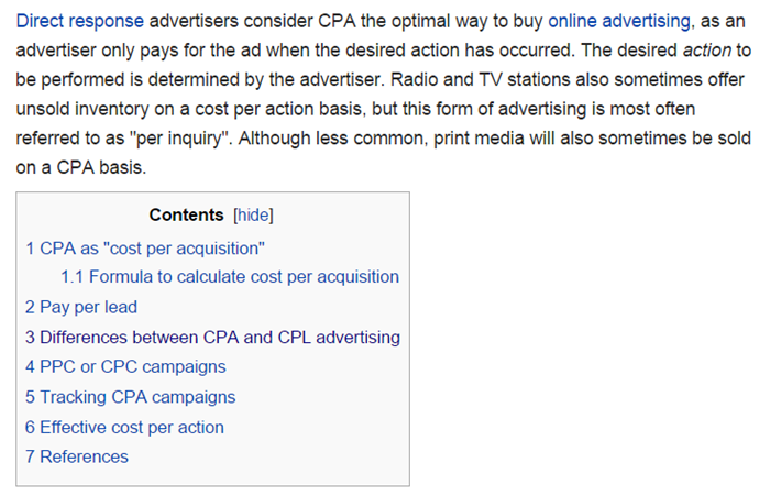
3. Ever Considered Adding a Table of Contents?
Visitors usually skim text because they are not sure if it’s worth their time. Sometimes they are only interested in certain parts of a subject, other times they are looking for new information. Either way, adding a table of contents that gives them more control over what they read and improves navigability might encourage them to spend more time on your page. There are several types of tables of contents, and each of them can work well on your site, so it’s up to you to decide which one you will be using.
- Image-based table of contents (difficult to create, great for visual impact)
- Text and link-based table of contents (significantly improve navigability)
- Typical Wiki-style table of contents (not the best looking, but brilliant in terms of navigability)
4. Add Deep Captions to your Images
Everybody knows that well-placed images increase the visual appeal of an article, so I’m not going to insist on this. But did you know that, after titles and subheadings, captions represent the most-read parts of a page?
A recent study conducted by Kissmetrics revealed that captions are read, on average, 300% more than the article itself. If you’re copy is designed to sell a service or product, you should create a deep caption (2-3 sentences) with your Brand’s name as well as a detailed description of your specific offering. On the other hand, if you are writing how-to articles or guides, complicated visuals can be accompanied by deep captions that put the image into context.
5. Spice up your Article with Alternative Forms of Content
There are various forms of content that internet users enjoy consuming: video (which is undoubtedly the most popular type right now), infographics, podcasts, content visualizations, surveys, and interactive content, among others.
What you want to do is to alternate between written content and other forms of content. For example, you can embed videos or infographics in your articles to provide added value for your visitors. Give users the option of choosing the format that they want to consume your content in. With some careful planning, you can create rich-media content that you can repurpose as derivative content (e.g. A video’s transcription can be repurposed into a white patter, or as a blog-post on your site).
This type of content is also easier to promote online. The first example that comes to mind would be CopyBlogger, which has recently adopted podcasts. To prevent visitors who preferred reading from leaving, they also created well-formatted transcripts beneath the recording on Rainmaker.fm.
6. Sidebar or No Sidebar?
Sidebars represent standard features of websites and blogs. The problem is that most webmasters use them without giving them too much thought. Surprisingly, even an optimized side-bar like the one on Backlinko only gets 1.9% clicks on the most important element.
Several case-studies proved that sidebars are nothing but distractions. But before you change the design of your blog completely, I recommend that you investigate with some A/B testing (version A – with the sidebar, version B – without the sidebar).
7. Keep your Posts Narrow
Sue Anne from SuccessfulBlogging recommends a column width of 80 characters or less for blogs. Wide columns might be detracting from your user experience and making the article impossible to read on smaller screen or mobile devices.
8. Break up Your Content Creatively
Images represent the most common solution for breaking up blocks of text. But this doesn’t mean that you should insert an image after every paragraph. Here are a few creative ways for you to break up an article, while also adding more diversity to it:
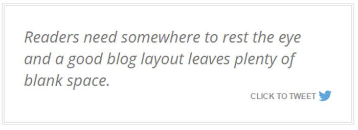
- Embedded social media elements: are a relatively new concept, so if you plan on using them, now would be the ideal time. From my experience, ‘tweet this’ call-to-actions work best. There are various plugins that you can use to embed social media on your site. Content-wise, I suggest that you use a memorable line, an interesting statistic, or an emotional trigger for your embedded tweet or Facebook post. This will enable you to break-up the text and also get some extra social signals.
- Keep your paragraphs short and sweet. Blocks of text create the impression that the article is longer than it is. Readers need white space to rest their eyes, and the best way to do this is by breaking up your content in sizeable chunks.
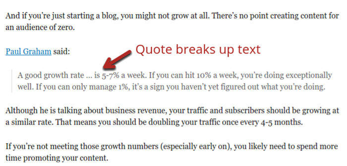
Image Source: QuickSprout
- Use Quotes: besides breaking up the text, quotes have the added bonus of offering more credibility to your article. I usually quote at least one influencer from my niche when I’m trying to prove a point. Quotes can also be used as part of your marketing strategy. You can contact the influencer referenced in your quote and ask him to share your article (if he liked it), or you could contact him prior to writing your post to find out his opinion on a specific matter.
- Use relevant links to direct readers to other –preferably the best- articles on your site, or to reference the sources you used while creating the post.
- Don’t forget about bullet points! Everybody loves bullets, including Google. Naturally, you should include a natural amount of bullet points to summarize certain ideas, or to organize data. They will make your text easier to read and they will also improve SEO. You can also use enhanced bullet points (which can be edited from the HTML code) for a more powerful visual impact.
- Use bold to highlight important sentences in your text, and Italicize – but only when it’s relevant to your content.
CONCLUSION
The last thing you need to do is to monitor and evaluate why you got the results you did. You can do this by looking at the browser through your visitors’ eyes with software such as Crazy Egg. With this tool, you can create user-behaviour heat-maps that will tell you what type of content they find most engaging, what they are clicking most etc.

When it comes to page optimization, the testing never ends. If you want to increase user engagement you will have to implement new strategies and monitor their performance. Good luck!