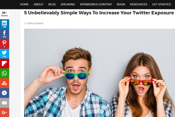
Let’s be straight. Blogging isn’t easy. Considering the overwhelming competition, bloggers have to balance diverse tasks; writing, editing, social media marketing, community building and email marketing. Adding yet another task – designing – is probably something that you don’t need.
Fortunately, in today’s world, you don’t need design skills to be a designer. You can use DIY graphic editing tools like Canva or social media management tools with built-in editors like DrumUp to make the graphic designing process effortless. This is 7 great ideas to create incredibly effective blog graphics, effortlessly.
1. Choose emotion over objects
One of the most common ways to find a blog cover is by running a search through a stock image database like Pixabay or Unsplash. If you want to make your blog cover more striking, simply switch your typical search terms (probably object-based like “people working on laptops”) with words that describe emotions (like “surprise” or “shock”). Most of these searches will lead you to eye-catching images that can increase the engagement factor of your blog.
Try and keep it simple and classy, and stay away from loud images that might steal the thunder and overwhelm the title. Instead, look for images that complement the title.
2. Experiment with typography
Images with words embossed on them can be very compelling, especially when shared on social media platforms. The visual serves the purpose of engaging readers while the text gives them insight into what they can expect on your blog post. Plus, adding text as an additional layer gives you a wide range of fonts and coloring possibilities to experiment with when creating your blog promotion posts.
When adding the text bear in mind the dimensions of social media posts, so you can make the letters large enough to stand out on a viewer’s desktop screen.
3. Use duotones and contrasts
Duotones are basically two contrasting colors being applied to an image. The result is a bright, stark image that demands attention. Duotones have become a trend of late, and Spotify was the first big name to turn all their marketing visuals into duotones.
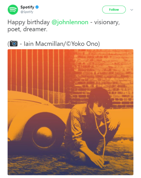
Duotone-styled images may seem complicated to create, considering that you have to apply the colors to not just the background but the objects in the image, but you could apply the concept to simple blog headers on graphic creation tools.
4. Consider GIFs for feature images
GIFs are animated, making them infinitely more engaging than static images. Additionally, they don’t consume as much data as videos do and load easily on all devices. Everyone loves a good GIF, as you can clearly tell from social media posts. Why not use GIFs as stand-alone blog headers?
Check out the one below that we used for our blog post which was titled: “5 Surprising LinkedIn Tips for Small Businesses That Actually Work”. Effective, don’t you think?
They’re fairly easy to create using GIF makers, but you don’t have to go through the trouble to create them. Curating them from sources like GIPHY or tools that integrate with the site is good enough.
5. Apply minimalism to direct attention
Minimalism is a powerful tool in terms of drawing attention in crowded spaces. Imagine a billboard with loud, bright colors alongside one of Apple’s, with its light and subtle coloring. Which one are you more likely to notice? Exactly.
With mobile dominating device usage, minimalism has become more important than ever. Plus, you can easily create subtle, tasteful blog covers using photo editing tools.
6. Pay attention to shareability
A lot of research is being conducted these days to ascertain the “formula” of shareable content. As a result, there exists a lot of data on which colors, font styles and content formats are most popular in general and on specific social media platforms.
When creating your graphics on editing tools, it pays to cross-check your design decisions against data collected about “shareable” and “conversion-driving” colors and fonts.
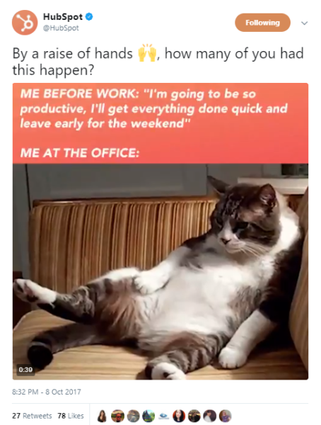
7. Play with shapes and icons
One of the easiest ways to highlight a specific element or piece of information on visuals is by using shapes in the background. Icons can be used to tell stories or depict themes. They can also be used to translate headers to the visual form. Several websites on the internet have offered up a treasure trove of free icons that anyone can access for their design requirements.
Shapes can be used to add headers or dialogues and make them pop, like HubSpot has done in the social media post below.
Now that you have several ideas to create attractive blog graphics, it’s time to put them to test. Use your favorite photo editing tool and get started with the designing process.