At 7:15 the alarm on my iPhone goes off, notifying me that it’s time to wake up. I briefly check my email, waiting a bit for my mind to snap out of its drowsiness, and then pull myself out of bed. Today the TV in my bedroom stays off, but I flip on the set in the living room to catch the headlines and weather while I make some coffee. Next, I sit down at my computer to fire off a quick email I forgot to send out the night before, sync up the news articles on my Kindle for the commute and head out the door to work. I see seven different screens in my first hour; three more are waiting for me at my desk at work. This is my typical device-filled morning.
Our current technological environment plays hosts to thousands of digital devices. People move from one screen to another, increasingly expecting their gadgets to integrate into a consistent experience across all platforms. Because of this it’s becoming more important that businesses, app creators, information architects, designers, and code slingers take responsibility for providing their clients with strategies for a multi-screen playing field– thinking beyond the smartphone to other devices. But solely creating several applications and scenarios for each device won’t cut for much longer. It’s time for us to start thinking about the relationships between different devices and how people utilize and interact with each of them.
I recently had the opportunity to attend the BrandPerfect Tour NYC. Design consultancy Precious hosted a workshop exploring several multi-screen patterns, the context of the user, and connections between devices. Their documentation of these relationships gives us a clear picture of current possibilities between devices and provide some great solutions on your next multi-platform project.
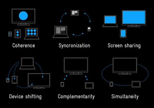
So what are they? Here’s a quick breakdown of the six different patterns they identified.
Coherence:
Most people quickly become familiar with the functionality and performance of whatever app or site they’re using. With coherence each device has an optimized feature set based on their usage scenarios. Coherence is the basic model most websites and services are using when moving into the mobile realm — basic functionality and design altered for the specific device while keeping an intelligible experience as the environment shifts. The note-collecting SuperApp Evernote delivers an excellent example of this, keeping consistent core features across devices and expanding functionality where devices’ specs allow.
Synchronization:
Synchronization starts to focus on content and how it can be kept up-to-date with the user. The functionality of each screen reflects each of the others and the information is transitioned seamlessly to continue the experience as devices are interchanged. A great example is streaming movies with Netflix. The player updates the movie to the furthest point watched as you switch from computer to mobile device to television.
Screen Sharing:
Screen sharing has been around for a while with dual monitor desktops and projectors. Multiple screens share the same source, averting the limitations of using a single screen size. Beyond our desktop solutions with second (and third and fourth) monitors, Air Display for iPad and JunkyardJumbotron allow you to stitch together screens for more screen real estate.
Device Shifting:
I see this pattern as somewhat of an umbrella term for what all of these patterns are ultimately describing. With device shifting content, applications, functionality, and media easily move from one device to another. For many users having this shift from device to device is commonplace. A perfect and widely used example of this is Instapaper, a save-for-later reading service that delivers your news feeds to whatever device you have handy.
Complimentarity:
Screens can also supplement each other for an enhanced user experience. Through complimentarity combining two or more screens can access hidden information or unlock extended functionality that aids in the experience. The TiVo remote takes advantage of this type of relationship, giving instant access to controls, information about the cast, scheduled recordings, or upcoming episodes of whatever you’re currently watching. Having recently used applications set up this way, I can attest that it’s a pretty great feeling having two uniquely different devices sync up and work together.
Simultaneity:
While complementarity extends the experience, simultaneity is built in from the beginning. Multiple screens become dependent on each other, linking user actions to move, change, and edit content. The newly announced Wii U is a great example of some creative applications of simultaneity . It includes controllers with a built-in touch screens that work alongside your TV. All of the screens are used to fully experience the games.
The recent redesign efforts of the Google interface completely reflect the type of thinking and vision behind using these patterns. They are focusing their offerings into a more unified and flexible experience, no matter where you enter into it.
“The way people use and experience the web is evolving, and our goal is to give you a more seamless and consistent online experience—one that works no matter which Google product you’re using or what device you’re using it on.”
With billions of mobile tech users in the world, the majority of the population is already carrying around devices for us to start connecting together. As developers of these products, identifying these patterns earlier on in the process will help us understand ways in which we can orient our devices for a better experience. And this is just the beginning– new patterns will emerge as hardware limitations dissolve, new ways of organizing content are created, and innovative input methods are developed and adopted.
You can view Precious’ original presentation and blog article at their weblog, www.precious-forever.com
Author: Seth Whitton, Designer, Alexander Interactive